Analyse 2D
Overview
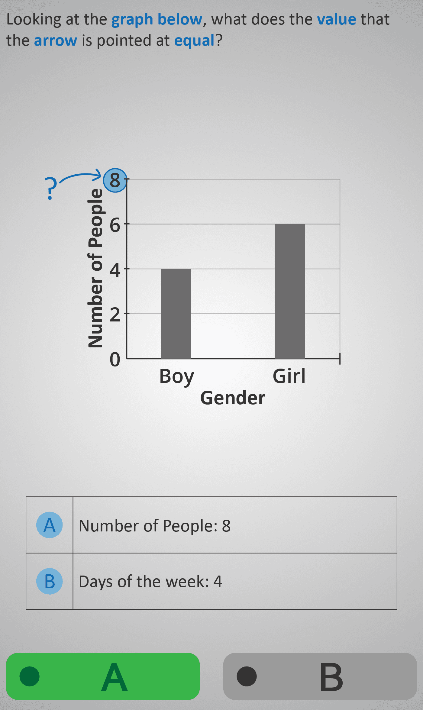
In Analyse 2D, students work with simple bar graphs to connect quantities with categories. The graphs display the number of boys and girls, and the exercises guide learners to interpret what different parts of the graph mean. Students begin by identifying numerical values marked on the vertical axis (e.g., recognising that the arrow pointing at “8” represents “Number of People: 8”). They then practise distinguishing between values and categories, deciding whether a label refers to a quantity (such as “8 people”) or a category (such as “Boy” or “Girl”).
The tasks use multiple-choice options with visual cues like arrows and highlighted numbers, helping students focus on linking the graphical features to the correct meaning. Through these step-by-step questions, learners strengthen their ability to read bar graphs accurately, avoid common mix-ups (such as confusing axis labels with values), and become comfortable interpreting categorical data. This Phlow provides an essential foundation in data analysis, preparing students for more complex graph-reading skills in later stages.
Prerequisite Knowledge Required
- Familiarity with basic data representation (see Analyse 1B and Survey 1).
- Understanding that graphs show quantities on one axis and categories on the other.
- Early practice identifying numbers and categories from simple pictograms or tally charts.
Main Category
Data & Graph Interpretation
Estimated Completion Time
Approx 6-10 seconds per question. 20 questions total. Total time: 2-4 minute.
Cognitive Load / Step Size
Low to moderate — each step isolates one concept (reading a value, matching a label, or interpreting meaning). The gradual sequence allows learners to build understanding without overload.
Language & Literacy Demand
Low — questions use short, clear sentences (“What does 8 represent?”). Visual prompts minimise reading strain. However, learners must recognise category words like “Boy” and “Girl.”
Clarity & Design
Uses clear bar graphs with distinct colour coding and labelled axes. Arrows and highlights guide attention precisely to the part of the graph being referenced. The design is functional, not decorative — supporting direct focus on interpretation.
Curriculum Alignment
Aligned with the Statistics and Data strand of the Irish Junior Cycle mathematics curriculum: “Interpret and compare categorical data represented on bar charts; identify what quantities and categories are being shown.”
Engagement & Motivation
Relatable and accessible — uses everyday contexts (people by gender) to make graph reading intuitive. The bright visuals and arrow cues keep the learner visually engaged.
Error Opportunities & Misconceptions
- Confusing which axis shows categories vs. quantities.
- Interpreting the height of the bar without reading the scale.
- Misreading labels or assuming equal values for bars of similar height.
Transferability / Real-World Anchoring
Highly transferable — supports reading of any simple bar chart, from classroom surveys to everyday infographics.
Conceptual vs Procedural Balance
Balanced — combines conceptual understanding (what graphs represent) with procedural skill (how to read data accurately).
Learning Objectives Addressed
- Identify quantities from the vertical axis on a bar graph.
- Distinguish between category labels and numerical values.
- Interpret visual data representations accurately.
- Build fluency in connecting graphs with real-world quantities.
What Your Score Says About You
- Less than 5: You may be mixing up labels and values — review how axes represent different information.
- Between 6–7: You can read most graph data but occasionally confuse categories or scales.
- Between 8–9: You interpret bar graphs accurately and understand their structure well.
- 10/10: Excellent comprehension — you can confidently read and explain bar graphs in any context.