Pie Chart 2A
Overview
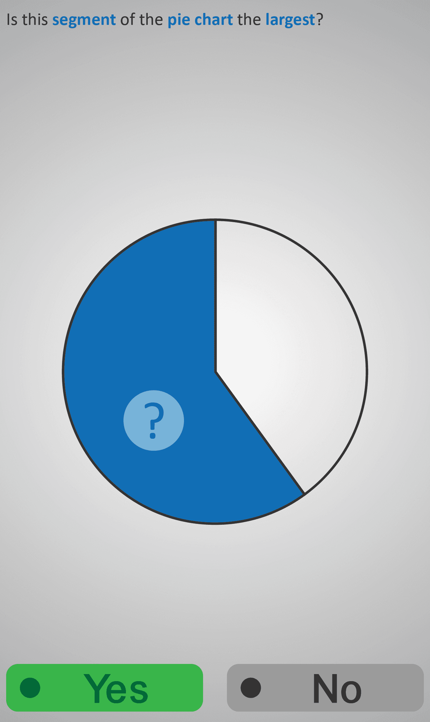
Helps students build skills in comparing and interpreting segments of a circle. Learners are asked to visually assess pie chart sections, deciding whether a highlighted segment is the largest, or identifying which of two labelled segments (A or B) is bigger.
Through these tasks, students practise comparing areas, improving their ability to estimate proportions and interpret data shown in circular charts. This Phlow encourages visual reasoning and prepares learners for more formal work with fractions, percentages, and data representation.
Prerequisite Knowledge Required
- Recognition of basic 2D shapes, especially circles and sectors (see Shapes 1).
- Understanding of comparison terms: larger, smaller, equal.
- Early exposure to bar or pictographs for representing data.
Main Category
Data and Statistics / Visual Comparison
Estimated Completion Time
Approx 6-10 seconds per question. 20 questions total. Total time: 2-4 minute.
Cognitive Load / Step Size
Low to moderate — visual tasks with minimal text. The step size is appropriate, progressing from simple “which is larger?” comparisons to interpreting labelled sectors.
Language & Literacy Demand
Low — concise prompts like “Which segment is bigger?” keep reading load minimal. The visual representation carries most of the meaning.
Clarity & Design
Strong visual clarity — clean, colour-coded pie segments allow easy comparison. Labels (A, B) and highlights direct focus effectively without unnecessary detail.
Curriculum Alignment
Irish Junior Cycle Mathematics – Statistics Strand:
- “Interpret and compare graphical representations of data.”
Engagement & Motivation
High — colourful visuals and simple comparisons make the task intuitive and enjoyable. Students gain confidence through visual success before moving to numerical interpretation.
Error Opportunities & Misconceptions
- Learners may confuse arc length with area or focus on colour intensity rather than size.
- The design ensures clear segment boundaries to prevent misinterpretation.
Transferability / Real-World Anchoring
Directly applicable to reading charts in newspapers, surveys, and reports. Builds foundational understanding for fractions, percentages, and proportional reasoning.
Conceptual vs Procedural Balance
Conceptual — focuses on visual interpretation rather than calculation. Builds intuitive understanding of relative size and data representation.
Learning Objectives Addressed
- Compare and interpret segment sizes in a pie chart.
- Develop visual reasoning about proportions and data.
- Prepare for fraction and percentage representation of data.
- Strengthen foundational statistical literacy.
What Your Score Says About You
- Less than 5: Needs more practice comparing visual quantities.
- 6–7: Understands the concept but may misjudge close-sized segments.
- 8–9: Accurately interprets most charts with good visual estimation.
- 10/10: Strong visual reasoning — ready to quantify data using fractions and percentages.