Survey 2A
Overview
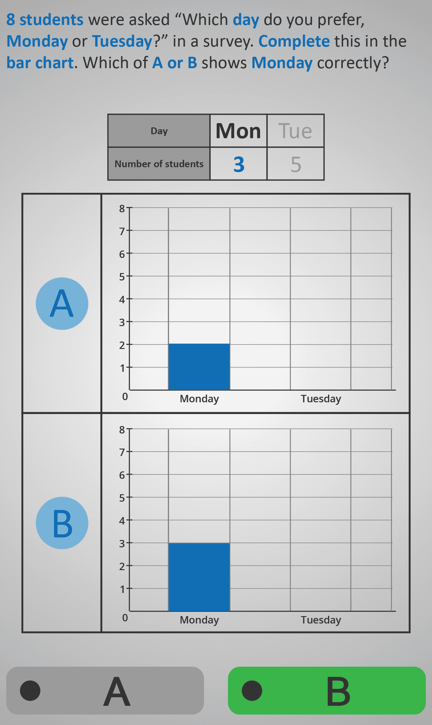
This activity helps students practise interpreting and constructing bar charts from survey data. The context is a simple class survey where students are asked which day of the week they prefer.
In the first task, students see that 8 students answered, with 3 choosing Monday and 5 choosing Tuesday. They must decide which of two bar charts (A or B) correctly shows the result for Monday (3 students).
In the second step, they repeat the process for Tuesday, identifying the correct bar chart that shows 5 students. In the extension, a second mini-survey is shown where 3 other students are asked if they prefer Wednesday or Thursday. Here, 1 chose Wednesday and 2 chose Thursday. Again, students compare charts A and B to identify the correct one for each day.
The exercise encourages learners to:
- Connect raw data from a table to its graphical representation.
- Read bar chart scales carefully.
- Develop confidence in verifying which charts are accurate and which are misleading.
Prerequisite Knowledge Required
- Linked Phlows: Survey 1 – recognising tally charts and basic data tables.
- Bar Chart 1 – reading simple bar charts with one variable.
- Numbers 2A – comparing small numbers and understanding magnitude.
Main Category
Data Handling – Representing and Interpreting Data
Estimated Completion Time
Approx 6–10 seconds per question. 20 questions total. Total time: 2–4 minutes.
Cognitive Load / Step Size
Low to Moderate — each step introduces a single comparison between data and chart, reducing cognitive strain. The transition from tables to visual bars is clear and intuitive, with consistent scales supporting comprehension.
Language & Literacy Demand
Low — the context (days of the week, small whole numbers) is familiar, and visual cues dominate. Sentences are concise, allowing students to focus on interpreting the data rather than decoding text.
Clarity & Design
Excellent — bar charts are presented side by side (A vs. B) with clean axes and consistent labelling. Colour coding and height differences are clearly visible, enabling accurate comparisons and reducing visual ambiguity.
Curriculum Alignment
Irish Curriculum Strand: Data – Representing and Interpreting Data
- Collect, record, and represent data using bar charts.
- Interpret information presented graphically.
- Recognise and evaluate accuracy in data representation.
- Connect numerical data with visual displays.
Engagement & Motivation
Moderate to High — the class survey context feels relatable and practical. Choosing the “correct chart” offers a satisfying element of discovery while reinforcing real-world skills in evaluating visual information.
Error Opportunities & Misconceptions
- Misreading bar height or scale intervals.
- Confusing labels on the horizontal axis.
- Selecting the wrong chart when both look similar.
The clear side-by-side comparison helps highlight these pitfalls and encourages careful observation.
Transferability / Real-World Anchoring
Strong — skills in interpreting bar charts apply to everyday media, school reports, and exam contexts. Students also practise data validation, linking classroom surveys to broader data literacy.
Conceptual vs Procedural Balance
Balanced — the activity builds conceptual understanding of how data translates to visual height while reinforcing procedural skills in reading and comparing bar charts accurately.
Learning Objectives Addressed
- Read and interpret data presented in bar charts.
- Match numerical data to graphical representation.
- Identify errors or inconsistencies in data displays.
- Strengthen confidence in working with real-world data.
What Your Score Says About You
- Less than 5: Needs more practice linking table data to visual charts.
- 6–7: Understands basic interpretation but may misread bar heights.
- 8–9: Accurately matches data to graphs in most cases.
- 10 / 10: Excellent mastery — confidently reads, checks, and validates bar charts.