Analyse 3B
Overview
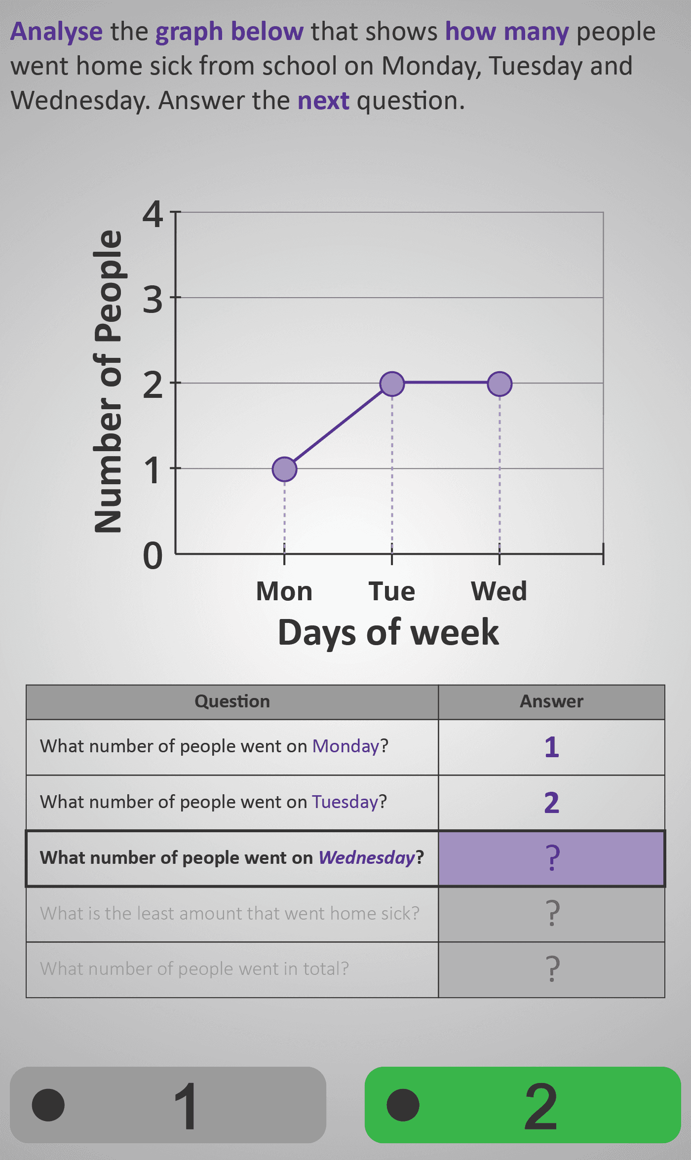
Builds on students’ earlier experience of organising data by introducing them to visual representation through graphs. Using a simple and relatable scenario — the number of students who went home sick on Monday, Tuesday, and Wednesday — learners explore how numerical information can be shown as points on a graph.
Step 1: Reading Values from the Graph
The Phlow guides students to read the graph carefully, identifying how many people correspond to each day of the week. They begin by finding values for Monday, Tuesday, and Wednesday.
Step 2: Comparing and Summarising Data
Learners then interpret comparative questions such as “Which day had the least number of people?” and “What is the total number of people who went home sick?” Each step encourages them to connect visual height on the graph with actual quantities on the vertical axis.
The activity also introduces the idea of patterns over time — for example, noticing whether numbers increase, decrease, or stay the same. By engaging with both numerical and visual cues, learners develop early data interpretation skills essential for analysing bar charts and line graphs at higher levels.
By the end of this Phlow, students can confidently read, compare, and summarise simple data from a line graph, strengthening their ability to interpret information visually and numerically.
Prerequisite Knowledge Required
- Linked Phlows: Analyse 3A – counting and organising data in tables.
- Add 2–3 – adding small numbers to find totals.
- Compare 2 – understanding greater than, less than, and equal to.
- Number Sense 3 – reading and interpreting small whole numbers.
Main Category
Data and Statistics – Interpreting Graphs
Estimated Completion Time
Approx 8–12 seconds per question. 5–6 screens total. Total time: 1–1.5 minutes.
Cognitive Load / Step Size
Moderate — each screen isolates one reasoning step (identify, compare, total). Visual cues such as dotted guide lines and highlighted labels reduce working memory strain and support accurate interpretation.
Language & Literacy Demand
Low — phrasing mirrors the structure of earlier data Phlows (“How many…?”, “What number…?”, “Which day…?”). Key terms (day of the week, total, least amount) are introduced gradually with consistent colour highlighting in purple.
Clarity & Design
Excellent — simple axes, large data points, and colour-coded cues make the relationship between numbers and graph position clear. The table beneath the graph reinforces data extraction, ensuring conceptual alignment between visual and numerical formats.
Curriculum Alignment
Irish Curriculum Strand: Statistics and Probability – Representing and Interpreting Data
- Read and interpret data presented in simple line graphs.
- Compare quantities using visual and numerical information.
- Identify minima, maxima, and totals from graphical data.
- Build readiness for more complex chart types (bar, double, trend).
Engagement & Motivation
High — the real-world context (students going home sick) is relatable, and the interactive process of completing the table step-by-step makes the learning feel exploratory and purposeful.
Error Opportunities & Misconceptions
- Misreading the vertical axis values.
- Confusing the day labels (x-axis) with the quantity scale (y-axis).
- Forgetting to add correctly when calculating totals.
These are minimised through scaffolded visual aids (dotted lines, highlighted questions, structured tables).
Transferability / Real-World Anchoring
Strong — graph reading is used daily in weather charts, fitness apps, and news reports. This Phlow provides the foundation for interpreting trends and comparing quantities meaningfully.
Conceptual vs Procedural Balance
Balanced — students both read (procedural) and interpret (conceptual) data. They practise not just finding numbers but understanding relationships between them.
Learning Objectives Addressed
- Identify values from a line graph.
- Compare data points to find least or greatest quantities.
- Calculate totals from multiple data values.
- Describe simple patterns in data visually.
What Your Score Says About You
- Below 5: Beginning — needs more focus on matching points to numbers on the axis.
- 5–7: Developing — can identify values but may misread comparisons or totals.
- 8–9: Proficient — accurately reads and interprets most graph data.
- 10 / 10: Mastery — reads, compares, and explains all values and patterns confidently.