Analyse 3C
Overview
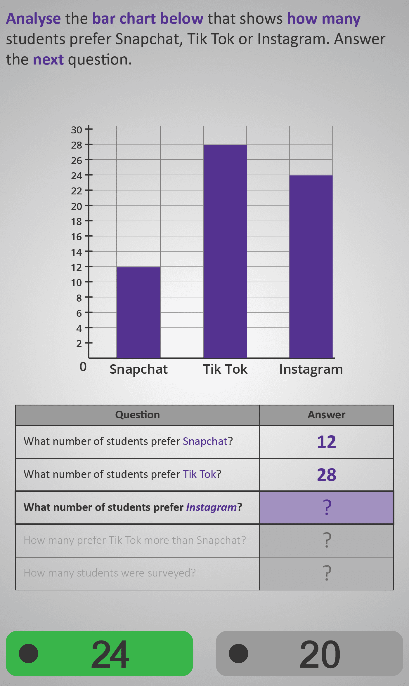
Develops learners’ ability to interpret and compare information displayed in a bar chart — a key skill in data analysis. The Phlow uses a relatable, real-world example showing how many students prefer Snapchat, TikTok, or Instagram.
Step 1: Reading Individual Values
Students begin by reading individual bar heights to find how many students prefer each app (e.g., 12 for Snapchat, 28 for TikTok, 24 for Instagram).
Step 2: Comparing Quantities
They then move to comparative reasoning — determining how many more students prefer TikTok than Snapchat. This builds understanding of differences and reinforces numerical reasoning through subtraction.
Step 3: Calculating Totals
Finally, learners calculate the total number of students surveyed, combining data across categories to reinforce addition and interpretation.
Each question builds logically on the last, helping learners move from simple reading of data to interpreting and comparing quantities. The clean visuals, consistent purple colour scheme, and structured question table guide attention effectively and reduce distractions.
By the end of this Phlow, students can confidently:
- Read bar heights accurately,
- Compare quantities between categories, and
- Find totals using addition or subtraction.
Prerequisite Knowledge Required
- Linked Phlows: Analyse 3A – counting and organising data in tables.
- Analyse 3B – reading and interpreting line graphs.
- Add 3 – adding and subtracting small numbers mentally.
- Compare 2 – understanding greater than, less than, and equal to.
Main Category
Data and Statistics – Interpreting and Comparing Data
Estimated Completion Time
Approx 8–12 seconds per question. 5–6 screens total. Total time: 1–1.5 minutes.
Cognitive Load / Step Size
Moderate — each step isolates a single skill: reading, comparing, or summing. Clear visual bars and grid lines help anchor numerical reasoning to spatial understanding.
Language & Literacy Demand
Low — the questions use consistent patterns (“What number…?”, “How many more…?”, “How many in total?”). Key words (bar chart, more than, total) are highlighted in purple to support vocabulary development.
Clarity & Design
Excellent — simple purple bars, clear numeric axis labels, and a question table reinforce dual coding between visual and textual information. Questions progress in small, logical increments to promote confidence and flow.
Curriculum Alignment
Irish Curriculum Strand: Statistics and Probability – Representing and Interpreting Data
- Read and interpret data presented in bar charts.
- Compare and order quantities visually and numerically.
- Use addition and subtraction to find totals and differences.
- Recognise how data can be represented for easy comparison.
Engagement & Motivation
High — the use of familiar social media examples captures attention and adds real-world relevance. The interactive progression and visual reinforcement make data analysis enjoyable and intuitive.
Error Opportunities & Misconceptions
- Misreading bar heights or mixing up categories.
- Forgetting to subtract correctly when comparing.
- Adding instead of comparing “more than” questions.
The structure addresses these through repetition, clear axes, and guided question scaffolds.
Transferability / Real-World Anchoring
Strong — bar charts appear in everyday contexts such as surveys, polls, and reports. This Phlow prepares learners to read and interpret data across academic and real-life settings.
Conceptual vs Procedural Balance
Balanced — students practise both reading data procedurally and understanding relationships conceptually (differences, totals, comparisons).
Learning Objectives Addressed
- Identify and interpret values from a bar chart.
- Compare quantities and describe which is greater or smaller.
- Calculate differences and totals using simple operations.
- Relate graphical data to real-world examples.
What Your Score Says About You
- Below 5: Beginning — needs more practice identifying quantities from the chart.
- 5–7: Developing — can read data accurately but may confuse comparison steps.
- 8–9: Proficient — reads, compares, and totals data confidently.
- 10 / 10: Mastery — interprets all values and relationships correctly, showing strong graph literacy.