Analyse 3F
Overview
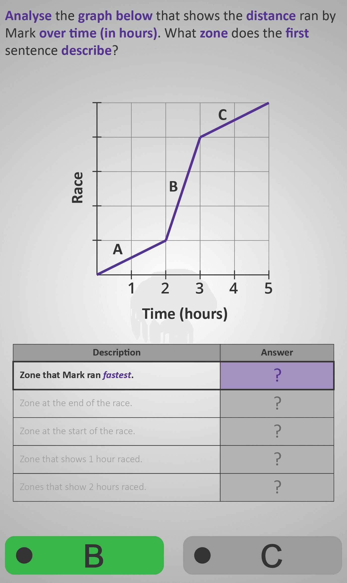
This Phlow helps learners analyse how distance changes over time using a line graph. Students compare slopes in different zones (A, B, and C) to determine speed and understand how the steepness of a line represents pace.
Through a series of multiple-choice questions, they identify which zone shows Mark running fastest, which zone marks the start or end of the race, and which sections correspond to given time intervals. By breaking the task into visual comparisons, the Phlow develops graph literacy, introduces the concept of gradient as speed, and connects data interpretation to real-world motion scenarios.
Prerequisite Knowledge Required
- Analyse 3E – Reading Basic Graphs.
- Compare 3B – Interpreting Tables.
- Measure 3C – Understanding Units of Time.
Main Category
Data and Statistics – Distance–Time Graphs
Estimated Completion Time
Approx 8–12 seconds per question (30 questions total). Total Time: 4–6 minutes.
Cognitive Load / Step Size
Moderate — each question adds one small reasoning step (comparing slopes or time intervals) without introducing new visual conventions. The gradual focus shift from visual recognition to analytical comparison keeps the cognitive load well balanced and maintains flow.
Language & Literacy Demand
Low to Moderate — sentences are short and supported by visuals. Students must read and interpret question prompts carefully, but meaning is reinforced by clear labels (A, B, C) and axes. Suitable for visual learners and weaker readers.
Clarity & Design
The design uses a clean purple graph with bold labels and clear axes for Time (hours) and Distance (km). Each screen highlights one concept per question, with strong contrast between zones and minimal text. The visualisation directly supports understanding rather than decoration.
Curriculum Alignment
Irish Junior Cycle Maths:
- Strand 4: Functions and Algebra — Learning Outcome 4.11: “Interpret linear functions that arise from real-world problems and represent them graphically.”
- Also supports Strand 1: Statistics and Probability — representing and interpreting data.
Engagement & Motivation
The race context feels dynamic and relatable, giving immediate meaning to abstract graph concepts. The use of zones (A, B, C) makes each question a mini “race moment,” maintaining interest and flow.
Error Opportunities & Misconceptions
- Confusing steeper lines with greater distance instead of faster speed.
- Misreading the x-axis (time) or assuming unequal spacing.
- Forgetting that flat sections (if any) represent rest or zero speed.
Each misconception is addressed visually with clear prompts, consistent axes, and guided feedback.
Transferability / Real-World Anchoring
Strong — the same reasoning applies to motion graphs, science experiments, and sports-tracking data where distance and time are compared.
Conceptual vs Procedural Balance
Balanced, leaning conceptual — while responses are procedural, understanding why a steeper slope means faster speed is central to mastery.
Learning Objectives Addressed
- Identify which part of a distance–time graph represents the fastest speed.
- Match graph zones with specific stages of a race (start, middle, end).
- Interpret time durations shown on a distance–time graph.
- Relate graph steepness to speed and real-world movement.
What Your Score Says About You
- Less than 5: Needs more practice reading and comparing graph slopes — review Analyse 3E.
- 6–7: Understands basic zones but may confuse time intervals and speed.
- 8–9: Correctly matches most graph descriptions — great visual reasoning!
- 10 / 10: Excellent — confidently interprets and explains motion using distance–time graphs.