Modal 3B
Overview
In this Phlow, learners apply their understanding of the mode to interpret visual data represented in bar charts. They learn that the tallest bar represents the category or value that occurs most frequently — the modal category.
Through three relatable examples, students practise identifying the mode using real-life data:
-
Hair Colour Chart:
A bar chart shows hair colours in a class. The tallest bar represents brown hair, meaning it is the most common — the modal category. -
Favourite Weekday Chart:
Students examine a chart of favourite weekdays and see that Wednesday has the highest bar. This reinforces that bar height corresponds to frequency. -
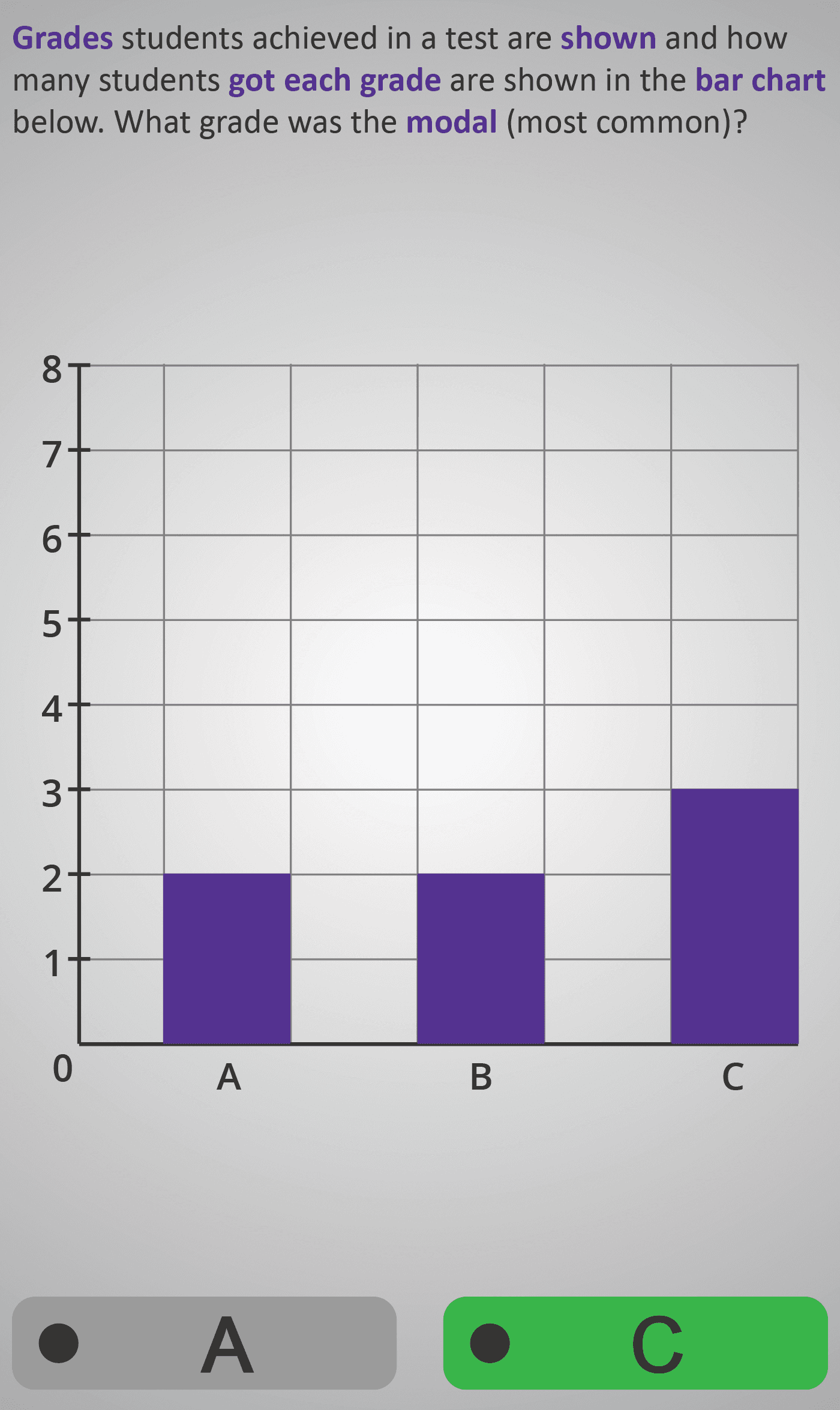
Grades in a Test Chart:
A chart of test grades (A, B, C) shows Grade C as the tallest bar, representing the most frequent grade — the mode.
Each screen uses clean, simple visuals that connect categorical data to frequency interpretation. Students visually link the idea of “most common” from number grids (Modal 3A) to bar chart representation, developing data literacy and pattern recognition skills.
By the end, learners can confidently identify the modal category on a bar chart — a foundational skill for reading and analysing real-world survey data and graphs.
Prerequisite Knowledge Required
- Modal 3A – Finding the Mode in Number Grids.
- Data Representation 2A – Reading Bar Charts.
- Counting Frequency 2A – Tally Charts.
- Understanding that mode means the most common value.
- Ability to compare bar heights visually.
- Familiarity with categorical data (e.g. colours, days, grades).
Main Category
Statistics / Data Handling
Estimated Completion Time
Approx. 10 seconds per screen (3 screens total). Total Time: 1.5 minutes.
Cognitive Load / Step Size
Low — each example shows a single bar chart with one tallest bar. This focused approach allows students to recognise patterns intuitively without requiring numerical comparison or calculation.
Language & Literacy Demand
Low — mathematical vocabulary such as modal, most common, and bar chart is colour-highlighted and repeated consistently. Everyday contexts (hair colour, weekdays, grades) make each question relatable and accessible.
Clarity & Design
- Consistent purple and grey colour scheme highlights focus terms.
- Charts are simple, well-labelled, and evenly spaced.
- Y-axis numbering reinforces the idea of frequency without requiring counting beyond 8.
- Uniform scale and layout across screens support visual continuity.
Curriculum Alignment
Irish Junior Cycle Mathematics:
- Strand 4 – Statistics and Probability
- Substrand – Data and Representation
- Learning Outcomes:
- Interpret bar charts and identify the modal category.
- Link bar height directly with frequency.
- Communicate data insights using correct terms such as “mode” and “modal category.”
Engagement & Motivation
High — the use of familiar, everyday examples encourages curiosity and discussion. Students see how graphical data connects to real-life interests, making statistical reasoning fun and relevant.
Error Opportunities & Misconceptions
- Selecting the shortest instead of the tallest bar.
- Misreading or ignoring the y-axis scale.
- Confusing “mode” with “mean” or “median.”
- Thinking that bar width (not height) indicates frequency.
These are addressed through consistent design, clear axis labels, and guided highlighting of the tallest bar on each screen.
Transferability / Real-World Anchoring
High — learners can now interpret bar charts found in media, surveys, or school projects. Recognising the mode visually prepares them for comparing categories, analysing trends, and interpreting more advanced data visualisations in later levels.
Conceptual vs Procedural Balance
Strongly conceptual — no arithmetic is required. The focus is on visual reasoning and understanding how bar height encodes frequency, promoting intuitive interpretation of categorical data.
Learning Objectives Addressed
- Identify the mode (most common category) in bar charts.
- Interpret data using bar height as frequency.
- Link graphical representation to statistical meaning.
- Develop readiness to compare multiple data sets graphically.
What Your Score Says About You
- Less than 5: Review how bar height shows frequency — always look for the tallest bar.
- 6–7: You can recognise the mode visually but should double-check category labels.
- 8–9: You’re interpreting charts accurately and using correct vocabulary.
- 10 / 10: Excellent! You’ve mastered identifying the mode from bar charts and are ready for Modal 4, where you’ll explore data sets with more than one mode.