Modal 3C
Overview
In this Phlow, learners interpret survey data displayed in tables to determine the modal answer — the one that appears most often. Building on earlier Phlows (Modal 3A and 3B), students now transition from visual patterns in grids and bar charts to reading real-world data formats like surveys and categorical tables.
Across three relatable examples, students practise scanning, counting, and comparing repeated responses:
-
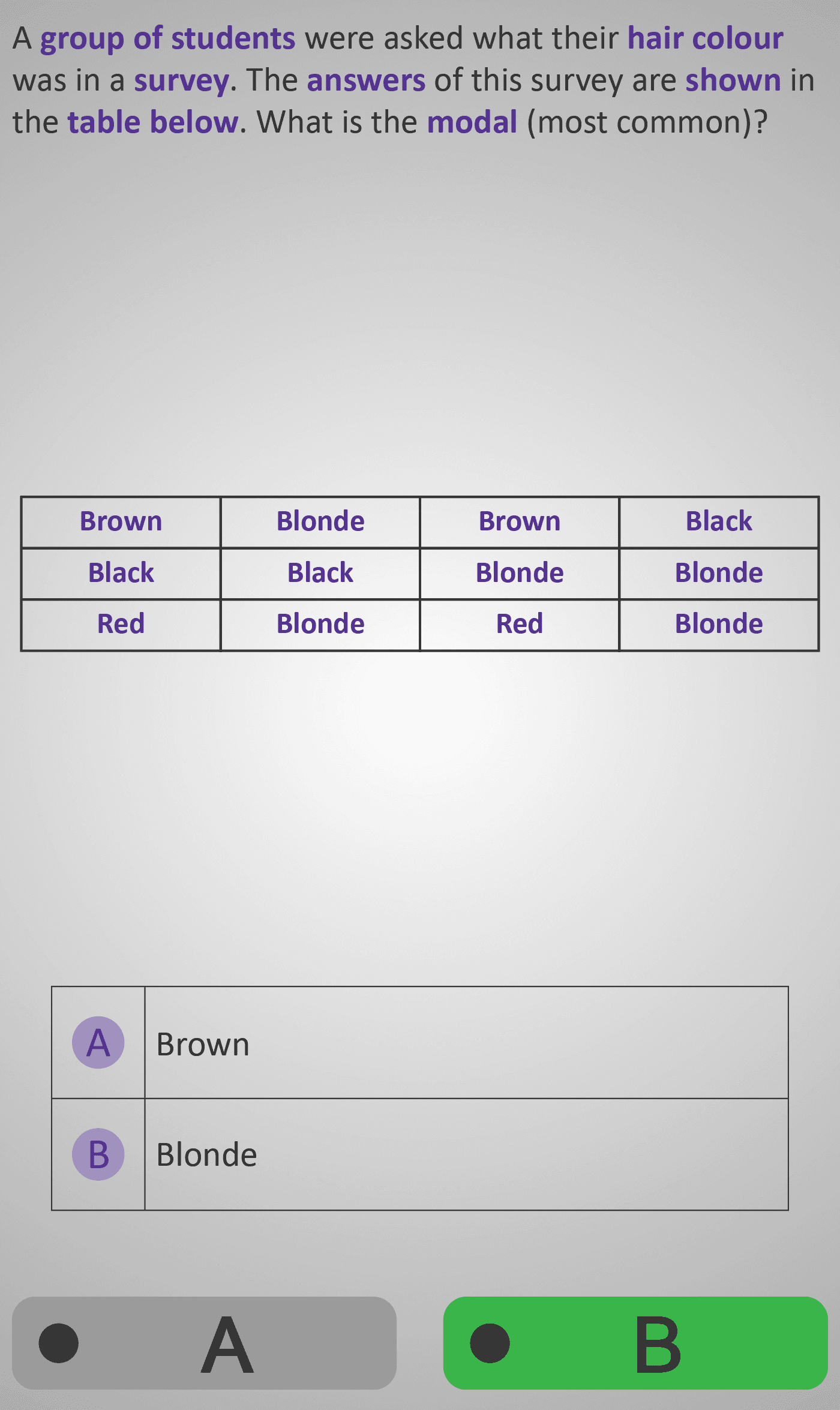
Hair Colour Survey:
A table lists student hair colours (Brown, Blonde, Black, Red). Students see that Blonde appears most often, identifying it as the modal hair colour. -
Least Favourite Weekday Survey:
Students review survey results of least favourite days and observe that Friday appears most frequently — the modal day. -
Favourite App Survey:
Learners read a table of favourite apps (Instagram, Snapchat, TikTok). Snapchat appears most often, showing that mode applies to all types of data — not just numbers.
This Phlow helps learners recognise that the mode is found by identifying the category with the highest frequency, even when no numbers are shown. It connects the idea of “most common” across multiple data representations — from grids and charts to text-based surveys.
By the end, students can confidently interpret categorical tables and identify modal responses in real-life survey data.
Prerequisite Knowledge Required
- Modal 3A – Finding the Mode in Number Grids.
- Modal 3B – Finding the Mode in Bar Charts.
- Data Representation 2B – Reading Tables.
- Understanding that mode means the most common item or category.
- Ability to read and compare entries in a simple table.
- Recognition that order does not matter — only frequency.
Main Category
Statistics / Data Handling
Estimated Completion Time
Approx. 10–12 seconds per screen (3 screens total). Total Time: 2–3 minutes.
Cognitive Load / Step Size
Moderate — students must visually scan multiple entries and compare them for repetition. Each example isolates one small table, allowing practice in pattern recognition while avoiding overload.
Language & Literacy Demand
Moderate — new contextual terms like survey, responses, and group of students are introduced in familiar real-world settings. Key mathematical terms (mode, most common, category) are highlighted for clarity.
Clarity & Design
- Tables are cleanly formatted with bold headers and consistent spacing.
- Purple text highlights key terms such as “survey,” “answers,” and “modal.”
- Each example mirrors realistic survey questions for authenticity.
- Only two-choice responses maintain simplicity and focus.
Curriculum Alignment
Irish Junior Cycle Mathematics:
- Strand 4 – Statistics and Probability
- Substrand – Data and Representation
- Learning Outcomes:
- Identify the mode in categorical data presented in tables.
- Interpret survey data by recognising repeated answers.
- Connect tabular data to graphical representations such as bar charts.
Engagement & Motivation
High — the survey topics (hair colour, weekdays, social media) are personally relatable, helping students connect statistics to everyday experience. The format builds confidence and interest in reading real data.
Error Opportunities & Misconceptions
- Overlooking repeated entries when scanning.
- Assuming order in the list matters.
- Confusing mode with mean or median.
Repetition and guided questions ensure focus on frequency — the defining feature of the mode.
Transferability / Real-World Anchoring
High — students learn how to interpret and summarise data from surveys, polls, and questionnaires. They recognise that the same principle of “most frequent” applies across all data formats — from small classroom surveys to large-scale reports.
Conceptual vs Procedural Balance
Conceptual — the focus is on reasoning and comparison rather than calculation. Students develop fluency in identifying frequency patterns within written or tabular data.
Learning Objectives Addressed
- Identify the modal category in survey and table data.
- Apply the concept of mode to real-world categorical data.
- Recognise that frequency determines the mode, not order.
- Develop confidence in reading and interpreting simple surveys.
What Your Score Says About You
- Less than 5: Review the survey table carefully — look for the response that repeats most often.
- 6–7: You can identify repeated items but may miss some frequency patterns — scan more slowly.
- 8–9: Great work — you interpret survey results accurately and understand the modal concept.
- 10 / 10: Excellent! You’ve mastered identifying the mode in tables and are ready for Modal 3D, where you’ll compare two groups’ data to see which mode is higher or more frequent.