Pie Chart 3A
Overview
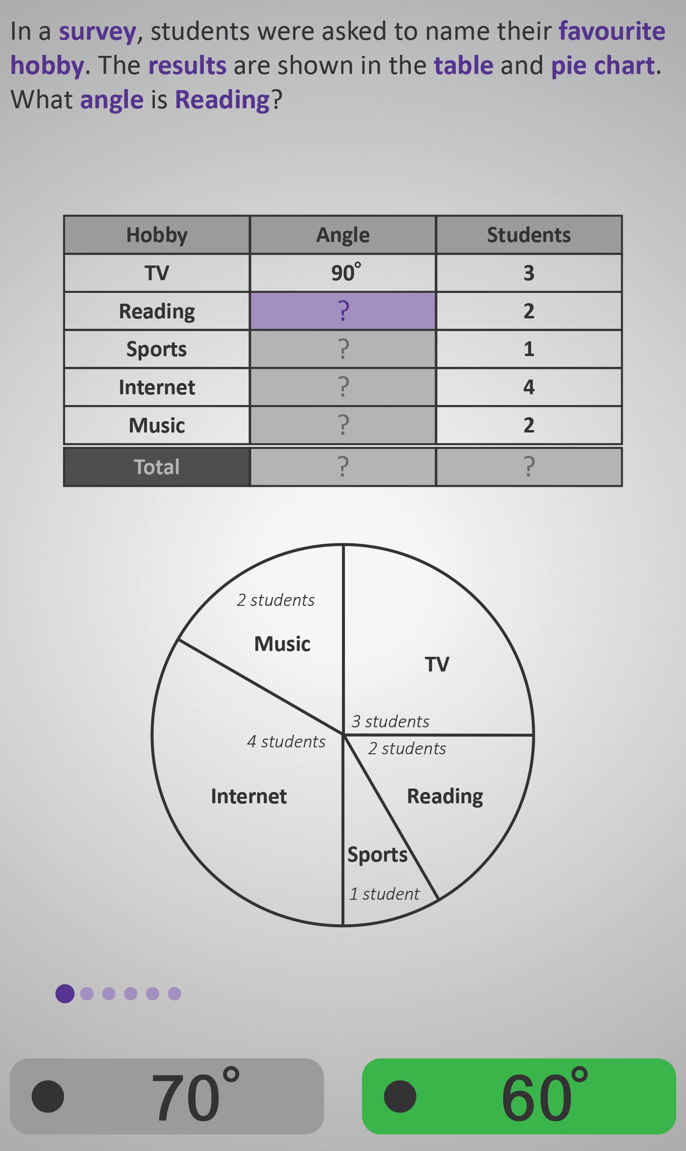
In this Phlow, learners explore how pie charts display data as parts of a whole circle — where 360° represents all results in a survey. Students use both a table and pie chart to connect the number of students to the corresponding angle for each category.
Through a series of guided steps, they:
- Identify data already given (e.g. TV = 90°, Reading = 60°).
- Calculate missing angles for other hobbies (e.g. Sports = 30°, Internet = 120°, Music = 60°).
- Verify that all angles together make a complete circle (360°).
- Find the total number of students by adding the frequencies (3 + 2 + 1 + 4 + 2 = 12).
Each screen gradually builds understanding:
- Early screens introduce one missing angle at a time.
- Later screens encourage pattern recognition — learners see that larger angles represent more students.
- Final questions confirm the 360° whole-circle concept and total data count.
This step-by-step design strengthens data literacy and connects geometry (angles) with numeracy (proportions). By the end, learners can confidently explain that “a pie chart is a circle showing data as parts of 360 degrees.”
Prerequisite Knowledge Required
- Angles 3A – Measuring Angles in Degrees.
- Fractions 2B – Parts of a Whole.
- Data 2A – Reading Pictograms and Bar Charts.
- Understanding that a circle has 360 degrees.
- Basic skill in adding and comparing angles.
- Ability to interpret simple data tables.
- Concept of each part representing a fraction of a whole.
Main Category
Data / Charts and Graphs
Estimated Completion Time
Approx. 10 seconds per screen (6 screens total) → 5–6 minutes total.
Cognitive Load / Step Size
Moderate — the visual pairing of table and chart helps distribute cognitive demand. Each screen isolates one task — finding a missing angle, checking totals, or verifying completion — before integrating all steps together.
Language & Literacy Demand
Moderate — key mathematical terms (survey, favourite hobby, angle, total) are repeated and highlighted in purple. Sentence phrasing remains conversational and consistent (e.g. “What angle is Sports?”).
Clarity & Design
- Table above chart reinforces link between numerical and visual data.
- Purple highlighting focuses attention on the current missing value.
- Labels (“2 students”, “4 students”) make relationships explicit and readable.
- Gradual fill-in sequence ensures comprehension before abstraction.
Curriculum Alignment
Irish Mathematics Curriculum – Data Strand / Junior Cycle Learning Outcome 1.9
- Read and interpret data presented in pie charts.
- Connect frequencies to angles in a 360° circle.
- Calculate missing values and verify totals.
- Understand that the size of each sector represents its proportion of the whole.
Engagement & Motivation
High — the “favourite hobby” context feels personal and relatable. Learners actively complete missing data, transforming static information into an interactive experience. The colourful, real-world design maintains curiosity and attention.
Error Opportunities & Misconceptions
- Forgetting that the total of a circle is 360°.
- Assuming all angles are the same size.
- Confusing angle size with frequency directly.
- Adding incorrectly or omitting one category from totals.
Each type of mistake is addressed progressively — ensuring strong conceptual and procedural understanding.
Transferability / Real-World Anchoring
High — pie charts appear in media, surveys, and reports. Understanding them equips learners to interpret real-world statistics and percentages. This Phlow lays the foundation for later proportional reasoning and data analysis.
Conceptual vs Procedural Balance
Balanced — learners practise a simple procedure (calculating and checking angles) while developing conceptual insight into how circle sectors represent fractions of a total.
Learning Objectives Addressed
- Understand that 360° represents a complete circle or total data set.
- Relate frequencies in a table to corresponding angles in a pie chart.
- Calculate missing angles and verify data totals.
- Interpret real-world data visually and numerically.
What Your Score Says About You
- Less than 5: Review how each section of a pie chart represents part of 360°. Try linking the table and chart again.
- 6–7: You can read most parts correctly — work on connecting student numbers to angles.
- 8–9: Excellent! You understand both the mathematics and meaning behind pie charts.
- 10 / 10: Perfect! You’re ready for Pie Chart 3B, where you’ll learn to convert data into pie chart angles using proportional reasoning.