Pie Chart 3B
Overview
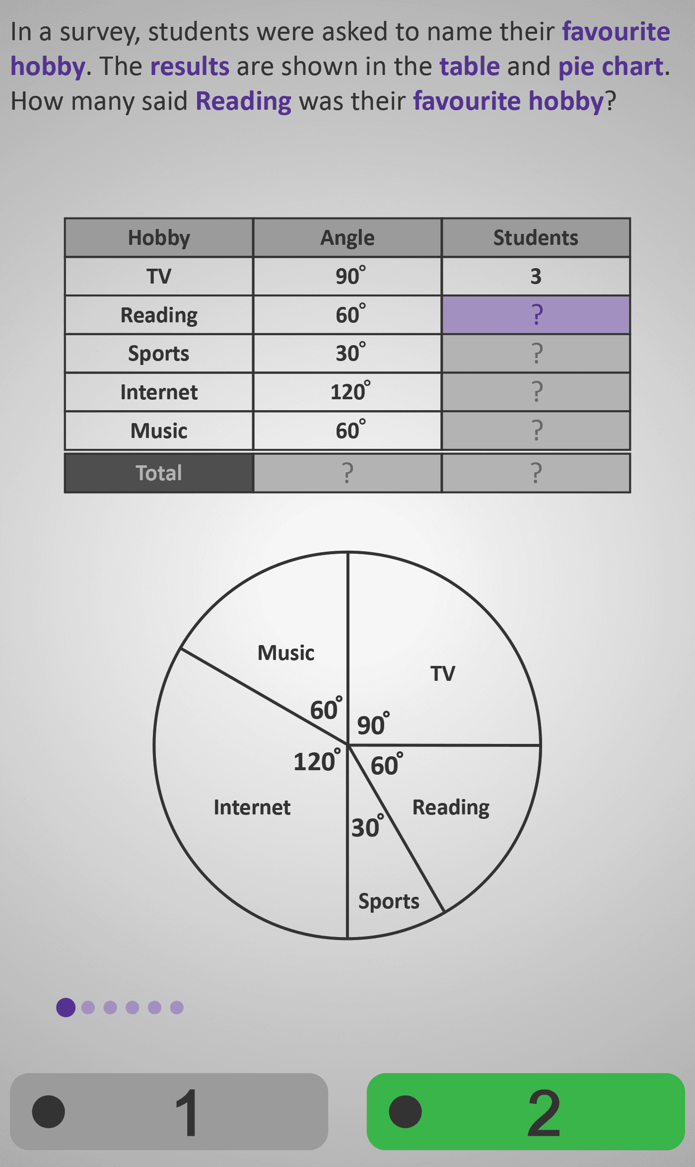
In this Phlow, learners deepen their understanding of how pie charts represent data proportionally. They explore a survey of students’ favourite hobbies — TV, Reading, Sports, Internet, and Music — where each hobby corresponds to a specific angle on a circle.
Starting from the information that a 90° sector (TV) represents 3 students, learners reason proportionally to determine how many students correspond to other angles:
- 60° (Reading) → 2 students
- 30° (Sports) → 1 student
- 120° (Internet) → 4 students
- 60° (Music) → 2 students
They then confirm that all angles add up to 360°, representing the whole survey, and that the total number of students is 12.
Through these steps, learners connect geometry (angles) and data handling (frequencies), gaining an intuitive grasp of proportional reasoning. This Phlow prepares them for later work with percentages and more advanced data interpretation.
Prerequisite Knowledge Required
- Understanding that a full circle equals 360°.
- Ability to multiply and divide whole numbers.
- Concept of proportion — recognising that larger angles represent more data.
- Pie Chart 3A – Interpreting Simple Sectors.
- Fractions of a Whole 2B – Understanding Parts of a Whole.
Main Category
Statistics / Data Representation
Estimated Completion Time
Approx. 8–12 seconds per question (30 total) → 4–6 minutes total.
Cognitive Load / Step Size
Moderate — each question introduces a new sector but follows the same proportional reasoning. Learners recall that 90° = 3 students and apply this rule to smaller or larger angles. The repetition builds fluency and pattern recognition without overloading memory.
Language & Literacy Demand
Low — short, clear phrasing (“How many said Reading was their favourite hobby?”) supports accessibility. The visual table and pie chart remove linguistic barriers, keeping focus on mathematical reasoning.
Clarity & Design
- Side-by-side layout of table and pie chart reinforces conceptual links.
- Purple highlight shows which hobby is currently active.
- All sectors are clearly labelled with degrees and colours for immediate interpretation.
- Hand-drawn style reinforces that 360° represents the whole circle — grounding abstraction visually.
Curriculum Alignment
Irish Junior Cycle Mathematics – Learning Outcome 3.3
- Represent data using pie charts and interpret data presented in them.
- Explain that the full circle represents the complete data set (360°).
- Relate the size of each sector to its corresponding frequency.
Engagement & Motivation
High — the “favourite hobbies” context feels relatable and human. The visual proportionality challenge encourages active reasoning and curiosity about how data representation works in real life.
Error Opportunities & Misconceptions
- Forgetting that the full circle = 360°.
- Treating changes in student numbers as additive rather than proportional.
- Confusing which sector represents which hobby.
- Misreading or rounding proportional values incorrectly.
Each potential error is anticipated and corrected through visual scaffolding and repeated proportional reasoning practice.
Transferability / Real-World Anchoring
Strong — skills apply to interpreting charts in news, surveys, elections, and reports. Understanding proportions here builds foundations for percentages, probability, and comparison tasks later on.
Conceptual vs Procedural Balance
Conceptual: Understanding that pie charts represent a whole through proportional sectors.
Procedural: Using multiplication or ratio scaling to calculate frequencies accurately.
Both are reinforced equally for durable learning.
Learning Objectives Addressed
- Recognise that 360° represents a complete data set.
- Use one known value to calculate unknown frequencies proportionally.
- Complete and interpret a frequency table from a pie chart.
- Verify total frequencies and chart accuracy.
What Your Score Says About You
- Less than 15: Revisit how one known value (e.g. 90° = 3 students) can help scale the others.
- 16–22: You understand how angles represent data — practise linking proportions more fluently.
- 23–29: Excellent reasoning! You can accurately interpret complete pie charts with multiple categories.
- 30 / 30: Outstanding! You’re ready for Pie Chart 3C, where angles are replaced by percentages and you’ll convert between fractions, percentages, and degrees.