Pie Chart 3E
Overview
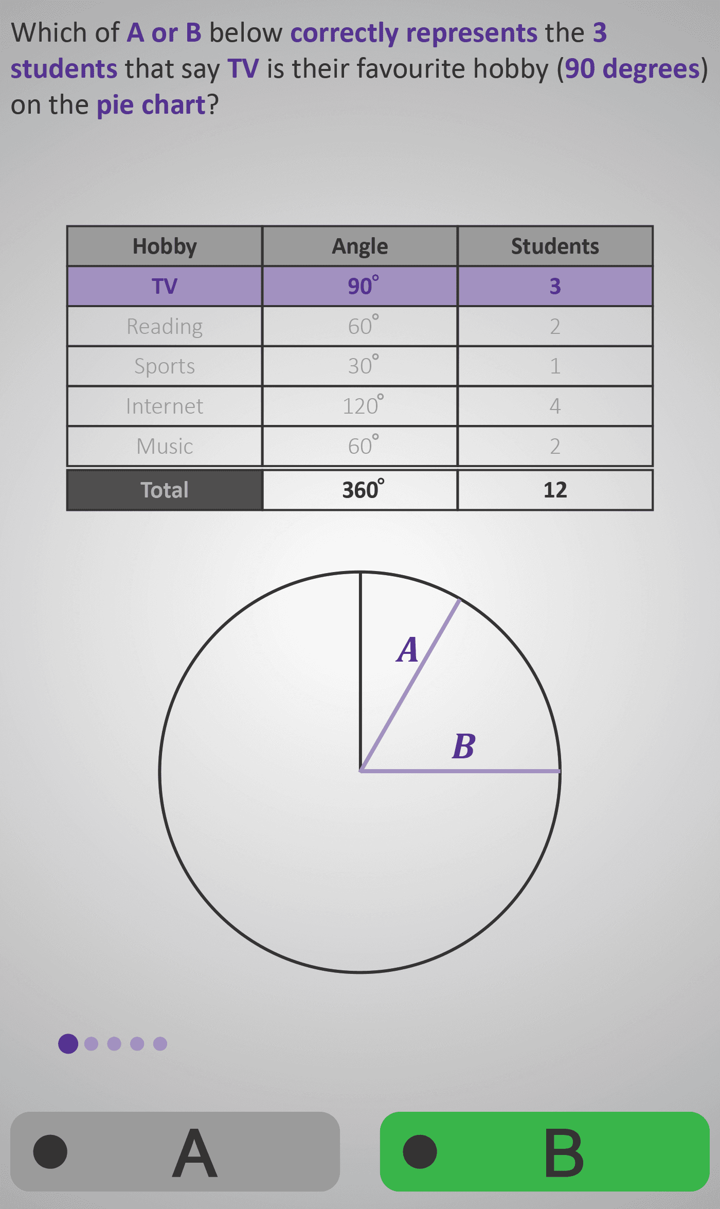
In this Phlow, learners consolidate their understanding of how data is represented in a pie chart by identifying which sector corresponds to a given angle or data value. Each question presents a hobby table (TV, Reading, Sports, Internet, Music) with matching angles and student numbers, and two labelled sectors (A or B) on the pie chart. Students must decide which one accurately represents the category — for example, “Which of A or B correctly represents the 2 students who chose Reading (60°)?”
This activity helps students to:
- Compare sector sizes visually, understanding that larger angles represent larger quantities.
- Connect numerical data (angles and student counts) to visual proportions on the chart.
- Apply proportional reasoning (e.g. 120° is double 60°, so Internet must be about twice as large as Reading).
By analysing and selecting between A and B, students strengthen their ability to interpret pie charts critically rather than mechanically. Multiple examples (TV = 90°, Sports = 30°, Internet = 120°, etc.) reinforce this reasoning pattern and develop a deep understanding of scale, proportion, and visual representation.
Prerequisite Knowledge Required
- Understanding that a full circle equals 360°.
- Awareness that each sector represents a proportion of the total.
- Ability to relate angles to quantities (e.g. 60° = one-sixth of the circle).
- Prior experience interpreting pie charts from Pie Chart 3A – 3D.
- Familiarity with comparing visual sizes and reasoning which slice is larger or smaller.
Main Category
Data / Charts and Graphs
Estimated Completion Time
Approx. 4–5 minutes total (5 screens, 10–12 seconds per question).
Cognitive Load / Step Size
Moderate — each step builds on prior Phlows (estimating and calculating angles) but shifts focus to visual discrimination and reasoning. The dual-choice structure (A or B) keeps the challenge targeted and achievable.
Language & Literacy Demand
Low to Medium — students interpret terms such as represents, correctly, angle, degrees, and favourite hobby, supported by colour cues and clear phrasing that reduce reading load.
Clarity & Design
- Table and pie chart clearly linked through colour and layout.
- Labels “A” and “B” simplify the decision process.
- Consistent hobby context reinforces familiarity from earlier Phlows.
- Sequential examples build pattern recognition and confidence.
Curriculum Alignment
Irish Primary Curriculum – Data Strand / Junior Cycle Learning Outcome 1.9
- Identify correct representations of data in pie charts.
- Recognise proportional differences between categories using visual cues.
- Develop critical reasoning to verify and justify visual representations.
Engagement & Motivation
High — the quick, game-like format of choosing between A or B keeps learners engaged. Each success builds confidence, while incorrect answers prompt reflection (“Why isn’t A correct?”). The familiar “favourite hobby” theme maintains continuity across the pie-chart series.
Error Opportunities & Misconceptions
- Confusing smaller and larger angles.
- Misjudging equal sectors (e.g. 60° vs 90°).
- Assuming alphabetical order (A/B) implies correctness.
- Overlooking the numerical data in the table.
Alternating correct answers and consistent feedback prevent pattern-guessing and ensure learners reason visually rather than memorise.
Transferability / Real-World Anchoring
High — learners practise interpreting visual data accurately, a skill directly applicable to charts in news, reports, and everyday contexts. This also strengthens spatial reasoning and data literacy.
Conceptual vs Procedural Balance
Strongly Conceptual — the emphasis is on understanding why one sector is correct, not merely identifying it. Learners develop analytical habits that support higher-order data interpretation.
Learning Objectives Addressed
- Identify which sector accurately represents a given data value.
- Compare sector sizes and interpret proportional relationships visually.
- Link the number of items, total, and angle within a pie chart.
- Strengthen spatial reasoning for interpreting graphical data.
What Your Score Says About You
- Below 4: Focus on comparing each sector’s angle size to the numbers in the table — remember, a bigger slice means more students.
- 5–7: Good progress! You’re matching numbers and visuals well — practise estimating angles more accurately.
- 8–9: Excellent visual reasoning — you’re interpreting proportional data confidently.
- 10 / 10: Superb! You’re ready for Pie Chart 4A, where you’ll construct pie charts using measured angles and protractors.