Plot a Graph 3
Overview
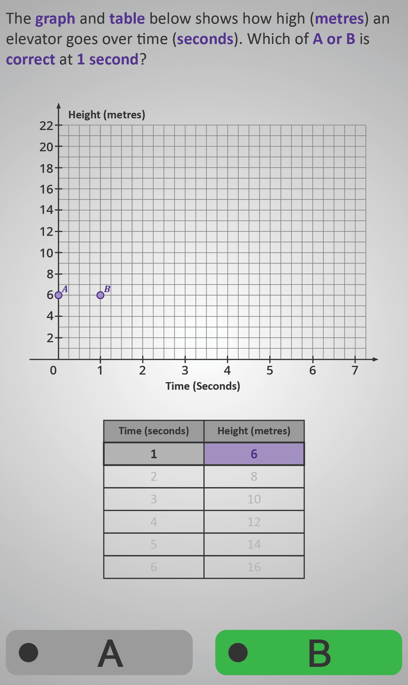
In this Phlow, learners practise reading data from a table and plotting it correctly on a coordinate graph. The context follows how high an elevator rises over time, with the vertical axis (y) representing height (metres) and the horizontal axis (x) representing time (seconds).
Each screen introduces one coordinate pair (e.g. at 1 second → 6 metres) and asks learners to decide which plotted point (A or B) is correct. As they progress, they gradually build a full linear graph showing a steady increase — the elevator moving upward at a constant rate.
This activity helps students:
- Identify the correct axis for each value.
- Match coordinates from a table to their plotted positions.
- Recognise consistent patterns (a straight-line increase).
By the end, learners understand that tables and graphs express the same relationship in two forms — one numerical, one visual — establishing the foundation for interpreting line graphs and slope awareness in later levels.
Prerequisite Knowledge Required
- Understanding that a graph has a horizontal (x-axis) and vertical (y-axis).
- Knowledge of ordered pairs (x, y) and which value comes first.
- Ability to read values accurately from a table.
- Familiarity with simple number sequences and patterns.
- Completion of earlier Phlows: Plot a Graph 1 (axes & coordinates) and Plot a Graph 2 (locating single points).
Main Category
Data / Graphs and Coordinates
Estimated Completion Time
Approx. 6–7 minutes, across 6 interactive screens (one for each second/point).
Cognitive Load / Step Size
Moderate and sequential — each screen introduces one data point at a time. Learners focus on locating and verifying each coordinate before the full line appears, maintaining clarity and preventing visual overload.
Language & Literacy Demand
Low–Medium — terms such as graph, table, height, time, coordinate, and axis are reinforced visually. Purple highlights draw attention to the current variable being discussed.
Clarity & Design
- Colour-coded tables and highlighted rows guide focus to the correct data point.
- Clear labels and grid lines ensure scale and direction are easily interpreted.
- Visual cues (points A and B) promote comparison and correction of common mistakes.
- Gradual build-up of the line graph demonstrates cause-and-effect (time ↑ → height ↑).
Curriculum Alignment
Irish Junior Cycle Mathematics – Learning Outcomes 3.13 & 3.14
- Plot and interpret points from a data table.
- Recognise relationships between two variables on a graph.
- Use graphs to describe real-world scenarios.
Engagement & Motivation
High — the elevator context provides a realistic sense of motion and purpose. Students see direct progress as each correct point adds to the line, giving visual satisfaction and reinforcing cause-and-effect relationships.
Error Opportunities & Misconceptions
- Swapping x- and y-values (time vs. height).
- Selecting the wrong plotted point when two are close together.
- Misreading axis scale intervals.
The A/B decision format encourages visual reasoning and double-checking of coordinate logic.
Transferability / Real-World Anchoring
Strong — plotting from a table applies directly to real data such as speed/time graphs, temperature charts, and financial tracking. It also prepares learners for proportional reasoning and rate of change concepts.
Conceptual vs Procedural Balance
Balanced — procedural plotting of ordered pairs combines with conceptual understanding of relationships between two changing quantities and the meaning of an upward trend.
Learning Objectives Addressed
- Read data from a table and represent it on a coordinate graph.
- Distinguish between independent (time) and dependent (height) variables.
- Identify correct points and link numerical data to its visual representation.
- Recognise and describe a consistent pattern of increase.
What Your Score Says About You
- Below 4: Review which axis represents time (x) and which represents height (y).
- 5–7: You’re identifying coordinates correctly — focus on consistent scaling and axis reading.
- 8–9: Excellent understanding — you’re plotting accurately and predicting future points.
- 10 / 10: Great work! You’re ready for Plot a Graph 4, where you’ll draw and interpret complete line graphs using real-life data sets.