Survey 3A
Overview
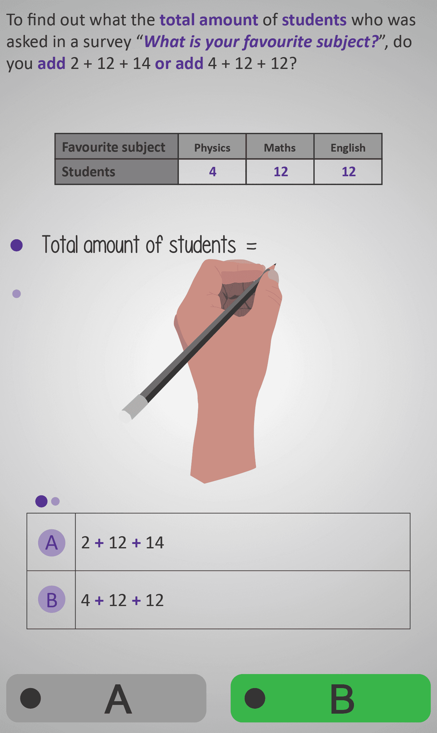
In this Phlow, learners practise adding frequencies from a data table to find the total number of participants in a survey. Each step builds understanding of how tables summarise data and how totals are derived by combining individual category counts.
Students are shown tables listing students’ favourite subjects (e.g. Physics, Maths, English, Geography). They decide whether to add or subtract the given numbers and then calculate the total — reinforcing that survey totals come from summing category values.
The interaction alternates between reasoning and computation. Some questions check conceptual understanding (“Do we add or subtract?”), while others involve performing the addition directly. This scaffolds both data interpretation and numerical fluency, ensuring learners understand not just how but why totals are calculated this way.
By the end, students can read data tables confidently, identify all relevant values, and compute total frequencies — a foundational skill for analysing real-world survey results, bar charts, and pie charts later on.
Prerequisite Knowledge Required
- Understanding that tables summarise data from surveys or investigations.
- Ability to add small whole numbers, including more than two numbers.
- Recognition that totals are found by combining all category counts, not by subtraction.
- Prior familiarity with:
- Survey 1 – Reading a simple data table
- Survey 2 – Interpreting individual categories
Main Category
Statistics / Data Handling
Estimated Completion Time
Approx 10–12 seconds per question (30 total). Total time: 5–6 minutes.
Cognitive Load / Step Size
Low to Moderate — each question isolates one reasoning step, either identifying the operation (add) or performing it. Repetition reinforces the connection between data representation and arithmetic operations without cognitive overload.
Language & Literacy Demand
Low — key terms such as total, survey, and students are repeated visually within table headings. Sentences are short, direct, and accessible at all reading levels.
Clarity & Design
- A hand-writing animation models the reasoning process visually.
- Tables are neatly structured with shaded headers and consistent layout.
- Sequential question flow (reason → calculation → total) aids comprehension.
- Colour cues (purple for numbers, green for operations) guide attention intuitively.
Curriculum Alignment
Strand: Statistics
Strand Unit: Representing and Interpreting Data
- Read and interpret data from tables and charts.
- Summarise data sets using totals and categories.
- Recognise and perform basic calculations linked to survey data.
- (Aligned with Junior Cycle Mathematics Learning Outcomes 2.19 and 2.20.)
Engagement & Motivation
High — the familiar “favourite subject” context makes the task relatable and concrete. The animated writing hand mirrors how students would work through similar problems on paper, creating a natural link between manual and digital reasoning.
Error Opportunities & Misconceptions
- Using subtraction instead of addition when finding totals.
- Skipping one column or misreading a category label.
- Adding the wrong number due to scanning or inattention.
These are corrected by visual highlighting, consistent formatting, and instant feedback on each step.
Transferability / Real-World Anchoring
Strong — this Phlow builds the essential habit of interpreting and summing real-world data, whether in polls, surveys, or classroom experiments. It connects maths learning to everyday decision-making and digital data literacy.
Conceptual vs Procedural Balance
Conceptual: Understanding why survey totals are found by addition.
Procedural: Practising accurate multi-number addition.
The design links reasoning to arithmetic fluency.
Learning Objectives Addressed
- Read and interpret numerical data from tables.
- Identify when to use addition to find totals.
- Calculate the total number of survey participants.
- Build readiness for representing data in bar and pie charts.
What Your Score Says About You
- Below 15: Review how survey data is structured — practise adding three or more values accurately.
- 16–22: Good understanding — check accuracy when reading table data.
- 23–29: Strong fluency — ready for larger data tables and chart-based questions.
- 30 / 30: Excellent! You’re ready for Survey 3B, where you’ll connect totals to proportions and percentages in charts.