Survey 3B
Overview
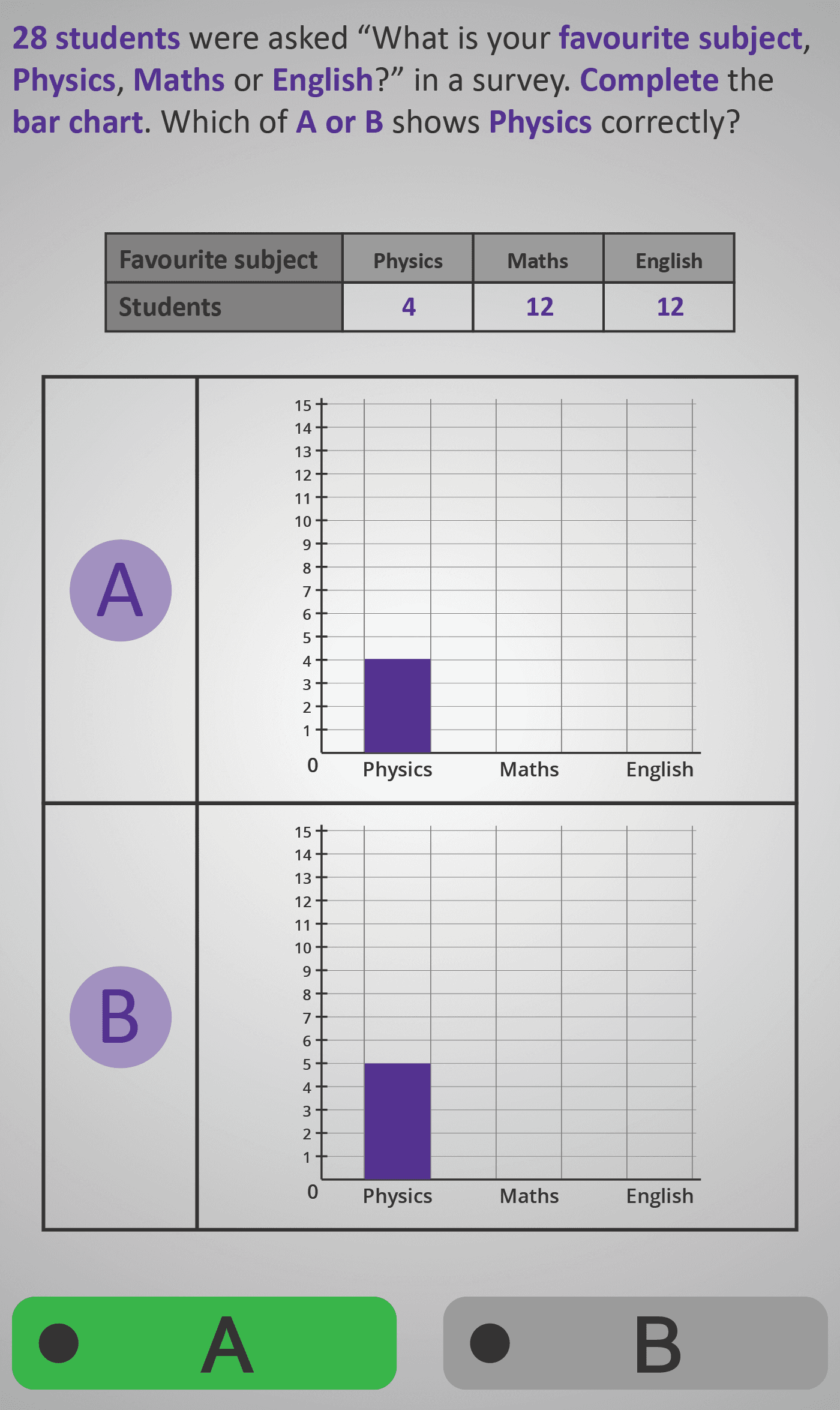
In this Phlow, learners practise interpreting a data table and transferring that information into a bar chart. Each step challenges them to match the number of students (frequency) for a subject with the correct bar height on a chart.
The survey data shows how 28 students responded to the question “What is your favourite subject — Physics, Maths, or English?”. Learners check which of two bar charts correctly represents each subject. Through this visual comparison, they reinforce their understanding of how frequencies correspond to bar heights.
The sequence of questions isolates one subject at a time (Physics, then Maths, then English). This focused structure supports recognition of patterns in height and value, ensuring learners grasp that the taller the bar, the greater the frequency.
By the end, students can confidently connect tables and bar charts, read off frequencies, and spot errors in graphical data representation — skills essential for later topics in data analysis, probability, and statistics.
Prerequisite Knowledge Required
- Understanding how to read and interpret a frequency table.
- Knowledge that bar height represents number of items or people.
- Basic number comparison (e.g., recognising that 12 is greater than 4).
- Prior familiarity with:
- Survey 3A – Adding frequencies to find totals
- Bar Chart 1–2 – Reading and comparing bar heights
Main Category
Statistics / Data Representation
Estimated Completion Time
Approx 10–12 seconds per question (30 total). Total time: 5–6 minutes.
Cognitive Load / Step Size
Moderate — each question isolates a single reasoning step, comparing two visual options (A or B) against a numerical value. This gradual approach builds visual–numerical association skills without overwhelming working memory.
Language & Literacy Demand
Low to Moderate — concise sentences and clear visuals support comprehension. Keywords like bar chart, students, Physics, Maths, and English are repeated to reinforce understanding. Reading demand is minimal due to strong visual scaffolding.
Clarity & Design
- Side-by-side comparison of charts (A vs B) focuses attention on key visual differences.
- Consistent table structure above the chart reinforces data reference.
- Vertical grid lines and labelled axes make scaling intuitive and clear.
- Purple highlights guide the learner’s focus to the active element.
Curriculum Alignment
Strand: Statistics
Strand Unit: Representing and Interpreting Data
- Construct and interpret bar charts from tabular data.
- Identify correct graphical representations of numerical information.
- Compare frequencies visually and numerically.
- (Aligned with Junior Cycle Mathematics Learning Outcomes 2.19 and 2.20.)
Engagement & Motivation
High — the visual “Which bar is correct?” decision-making feels like a puzzle. The progressive chart-building reinforces a sense of accomplishment and solidifies visual reasoning skills.
Error Opportunities & Misconceptions
- Misreading scale intervals (e.g., counting grid lines incorrectly).
- Confusing which bar corresponds to which subject.
- Choosing the taller bar automatically without verifying its value.
These are addressed through feedback, consistent table–chart alignment, and careful scaling on all visuals.
Transferability / Real-World Anchoring
Strong — this activity models how data is visualised in real surveys, polls, and reports. It connects mathematical skills with everyday contexts such as school surveys, opinion polls, and infographic reading.
Conceptual vs Procedural Balance
Conceptual: Understanding how numerical data translates into visual form.
Procedural: Selecting correct bars based on numerical comparison.
The Phlow integrates both to ensure comprehension and visual accuracy.
Learning Objectives Addressed
- Read and interpret numerical data from a table.
- Translate tabular data into bar chart form.
- Match quantities to correct bar heights.
- Evaluate which graphical representation is accurate.
What Your Score Says About You
- Below 15: Revisit how to match numbers to bar heights — practise simpler charts first.
- 16–22: Good understanding — improve accuracy by checking scale intervals carefully.
- 23–29: Strong graphical reasoning — ready to analyse dual or comparative bar charts.
- 30 / 30: Excellent! You’re ready for Survey 3C or Bar Charts 4–5, where you’ll interpret and compare more complex survey data.