Survey 3D
Overview
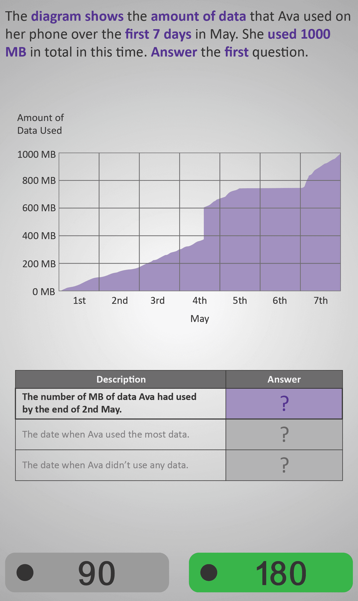
In this Phlow, learners explore how to read and interpret line graphs that show cumulative data. The graph tracks the amount of mobile data Ava used over the first seven days of May, reaching a total of 1000 MB by the end of the week.
Students answer three linked questions:
- How much data Ava had used by the end of 2nd May.
- The day she used the most data.
- The day she didn’t use any data.
Each question focuses on a specific graph-reading skill — identifying a value, comparing changes, and spotting zero-usage points. Through this progression, learners gain an understanding of how line graphs represent trends over time rather than isolated data points.
The design uses gradual scaffolding: earlier questions focus on reading quantities, while later ones require reasoning about slope (rate of change). This helps students connect the shape of a graph with its meaning. By the end, learners understand that:
- Steep sections show rapid increases,
- Flat sections show no change, and
- Cumulative graphs show totals increasing over time.
Prerequisite Knowledge Required
- Understanding that a line graph represents change or growth over time.
- Knowledge of axes: x-axis (time) and y-axis (quantity).
- Ability to read values and estimate between gridlines.
- Prior familiarity with:
- Bar Charts or Survey 3B – Reading frequency values visually
- Survey 3C – Summarising numerical data into structured form
Main Category
Statistics / Graphs and Data Interpretation
Estimated Completion Time
Approx 10–14 seconds per question (30 total). Total time: 5–7 minutes.
Cognitive Load / Step Size
Moderate to High — students must connect multiple ideas (values, trends, and time) while interpreting slope and total. The clear stepwise question structure supports cognitive efficiency and reduces overload.
Language & Literacy Demand
Moderate — questions use contextual phrases (“used the most data”, “didn’t use any data”) that link mathematical reasoning to real-world meaning. Vocabulary is consistent with prior Phlows, and visuals simplify comprehension.
Clarity & Design
- Purple shaded area under the line emphasises cumulative growth.
- Clear grid with bold axis labels for accurate reading of values.
- Questions appear directly below the graph, linking interpretation to data.
- Key totals (e.g., 1000 MB) highlighted in purple to draw attention.
Curriculum Alignment
Strand: Statistics
Strand Unit: Representing and Interpreting Data
- Interpret and read information from line graphs.
- Identify maximum, minimum, and unchanged values from graphical data.
- Understand real-world meanings of changes in cumulative graphs.
- (Aligned with Junior Cycle Mathematics Learning Outcomes 2.19, 2.20.)
Engagement & Motivation
High — the mobile data usage context is modern, relatable, and engaging. It transforms abstract numerical data into a meaningful story that connects directly with students’ daily lives and experiences.
Error Opportunities & Misconceptions
- Confusing total data used with daily usage (not recognising cumulative data).
- Misreading axis scales or estimating incorrectly between gridlines.
- Assuming steeper lines mean higher totals rather than faster increases.
Visual scaffolds, clear labels, and guided questioning prevent and correct these misconceptions.
Transferability / Real-World Anchoring
Excellent — this skill mirrors how real data is presented in everyday life: mobile usage charts, weather trends, or fitness tracking graphs. It builds vital data literacy and analytical reasoning for interpreting time-based data.
Conceptual vs Procedural Balance
Conceptual: Understanding what line slopes and flat segments mean in context.
Procedural: Reading and comparing values accurately from a graph.
Students integrate both to interpret, not just decode, graphical information.
Learning Objectives Addressed
- Read and interpret cumulative line graphs accurately.
- Identify maximum, minimum, and zero points on graphs.
- Connect graphical patterns to real-world contexts.
- Explain how slopes reflect rates of change in data.
What Your Score Says About You
- Below 15: Review how line graphs show change — practise reading values carefully.
- 16–22: Good progress — focus on connecting slopes with “more” or “less” usage meanings.
- 23–29: Strong graph interpretation — you understand both values and patterns.
- 30 / 30: Excellent! You can now analyse comparative or dual line graphs in Survey 4B or Trends 4A.