Survey 3F
Overview
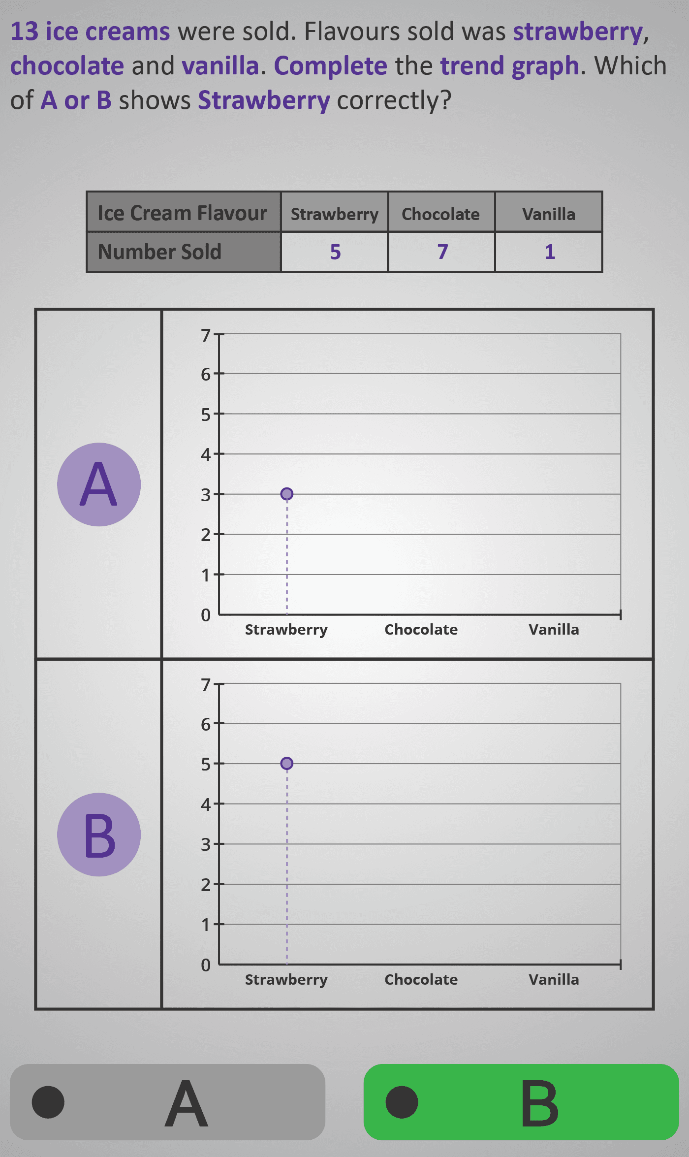
In this Phlow, learners connect numerical data from a table with its visual representation on a trend graph. The scenario shows how many of each ice cream flavour were sold:
- Strawberry: 5
- Chocolate: 7
- Vanilla: 1
Students are shown two versions of a trend graph (A and B) and must decide which one correctly shows each flavour’s value. They progress through three reasoning steps:
- Identify the correct plot for Strawberry.
- Identify the correct plot for Chocolate.
- Identify the correct plot for Vanilla.
Finally, learners interpret the difference between the highest and lowest values on the graph, reinforcing the concept of range in data. This activity helps them move from static tables to visual interpretation, developing an understanding of how numerical data translates into trends.
The consistent layout (table + graph + question) encourages pattern recognition and logical reasoning. By the end, learners can confidently:
- Match points on a graph to table values.
- Recognise highest and lowest data points.
- Interpret visual trends and value differences within a dataset.
Prerequisite Knowledge Required
- Understanding of frequency tables (from Surveys 3A–3C).
- Familiarity with graph axes — x-axis for categories, y-axis for quantities.
- Ability to compare values using simple bar or line graphs.
- Awareness that connecting lines show trends between categories, not continuous change.
Main Category
Statistics / Graphs and Data Representation
Estimated Completion Time
Approx 10–12 seconds per question (30 total). Total time: 5–6 minutes.
Cognitive Load / Step Size
Moderate — students interpret multi-step visuals, comparing points across two graphs and aligning each with values in the table. The repeated A/B format supports visual scanning and minimises working memory strain.
Language & Literacy Demand
Low to Moderate — simple phrasing and repeated keywords (trend graph, highest, lowest, flavour) reinforce understanding. Sentences are concise and supported by strong visual scaffolding.
Clarity & Design
- Each question isolates one concept — plotting, matching, or comparing.
- Graphs are clearly labelled with flavour names (x-axis) and sales (y-axis).
- Alternating “A or B” format keeps engagement high and focus sharp.
- Purple highlights link question text with relevant graph features.
Curriculum Alignment
Strand: Statistics
Strand Unit: Representing and Interpreting Data
- Construct and interpret line graphs from tabular data.
- Identify maximum, minimum, and range values from visual data.
- Understand the relationship between tables and graphs.
- (Aligned with Junior Cycle Mathematics Learning Outcomes 2.19, 2.20.)
Engagement & Motivation
High — the ice cream context is visually appealing and familiar. The comparison between two graphs feels like a mini puzzle, providing instant feedback and keeping learners curious and motivated.
Error Opportunities & Misconceptions
- Confusing point height with incorrect table values.
- Misreading axis scales or starting count from zero incorrectly.
- Assuming lines between points represent continuous change rather than category transitions.
Repetition, feedback, and clear graph labels help correct these misunderstandings quickly.
Transferability / Real-World Anchoring
Strong — this skill mirrors how data is shown in reports, sports statistics, and everyday comparisons. Recognising and explaining trends across categories prepares students for deeper work in Data Analysis and Functional Relationships.
Conceptual vs Procedural Balance
Conceptual: Understanding how line graphs show data patterns and value relationships.
Procedural: Matching plotted points to table data and comparing highest vs lowest values.
The Phlow integrates both effectively, fostering visual and numerical fluency.
Learning Objectives Addressed
- Read and interpret trend (line) graphs accurately.
- Identify and compare maximum, minimum, and range in data.
- Match visual graph points to tabular data.
- Understand how lines represent relationships between categories.
What Your Score Says About You
- Below 15: Revisit reading vertical scales and linking table data to graphs.
- 16–22: Good understanding — focus on comparing highest and lowest points clearly.
- 23–29: Excellent visual reasoning — you can explain why one graph is correct.
- 30 / 30: Perfect! You’re ready for Survey 4B – Interpreting Multi-Category Trend Graphs and Data Comparison 4A.