Analyse 4C
Overview
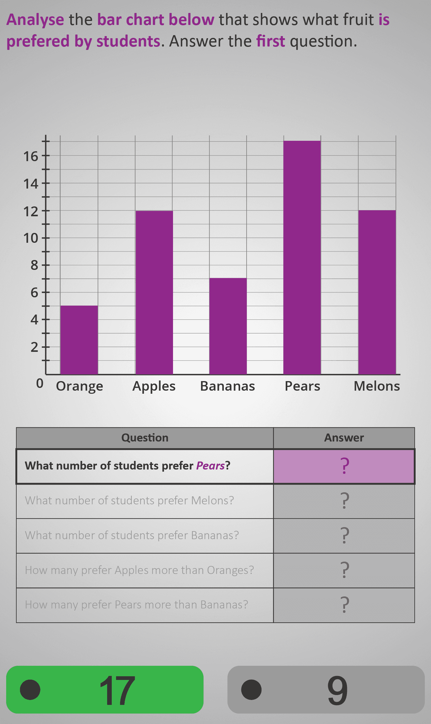
In this Phlow, learners develop their ability to read, compare, and interpret bar chart data. The chart shows how many students prefer different fruits — oranges, apples, bananas, pears, and melons — giving a clear and familiar context for comparing values.
Students begin by reading exact quantities from the chart using the vertical axis and bar heights, then move on to comparative reasoning such as:
- How many more students prefer apples than oranges?
- Which fruits did more than 11 students prefer?
- How many prefer pears more than bananas?
This gradual sequence guides learners from observation to comparison and numerical reasoning. By working step by step, students learn to combine arithmetic (addition and subtraction) with visual interpretation of data.
By the end, learners demonstrate confidence in extracting and comparing information from bar charts — a vital foundation for understanding data in surveys, reports, and scientific contexts.
- Read values accurately from a bar chart.
- Compare categories using subtraction and inequalities.
- Interpret questions using terms like “more than” and “less than.”
- Relate visual patterns to numerical relationships.
Prerequisite Knowledge Required
- Ability to read bar heights and axis labels on simple bar charts.
- Understanding that each bar represents a category (e.g., type of fruit).
- Confidence with addition and subtraction within 20.
- Familiarity with comparative language: “more than,” “less than,” “how many more.”
- Linked earlier Phlows: Analyse 3B – Interpreting Simple Bar Charts; Add 3B – Comparing Quantities by Difference.
Main Category
Analyse → Data Representation → Bar Charts
Estimated Completion Time
Approx 10–12 minutes (6–8 guided interactions).
Learning Outcomes
- Read numerical data accurately from bar charts.
- Compare and interpret data using difference and inequality.
- Answer multi-step questions combining arithmetic and reasoning.
- Connect data patterns to real-world understanding.
Cognitive Load / Step Size
Moderate — each interaction isolates one reasoning step (read, compare, or calculate). Consistent visuals and phrasing reduce extraneous load, allowing focus on the conceptual link between quantities and categories.
Language & Literacy Demand
Medium — the Phlow reinforces comparative phrases such as “more than 11,” “how many fewer,” and “difference between.” The repetition of key sentence structures strengthens comprehension and supports literacy in numeracy contexts.
Clarity & Design
- Bright purple bars ensure clear visibility and immediate category distinction.
- Gridlines and labelled axes promote precise reading of quantities.
- Each screen highlights one reasoning task to keep focus and reduce overload.
- Visual alignment between bars and labels improves accuracy and confidence.
Curriculum Alignment
Strand: Data and Chance
Learning Outcome: Students read, interpret, and compare information displayed on bar charts and use this data to solve real-life problems.
(Aligned with Junior Cycle Mathematics – Strand 2: Statistics and Probability, Learning Outcome 2.6.)
Engagement & Motivation
The familiar fruit preference survey gives immediate relevance. The structured flow — identify, compare, calculate — mirrors real-world decision making and builds a sense of progress. Each correct answer reinforces learners’ growing ability to interpret visual information.
Error Opportunities & Misconceptions
- Misreading bar heights or gridlines (e.g., 11 vs 12).
- Confusing “difference” with “total.”
- Overlooking comparison boundaries (e.g., “more than 11” ≠ 11).
- Ignoring scale increments (e.g., counting each line as one instead of two).
Corrective feedback and clear visual alignment help learners check their reasoning and develop attention to detail in interpreting data.
Transferability / Real-World Anchoring
Reading and comparing bar charts supports understanding in science, business, and daily life — from interpreting survey results to comparing measurements or class preferences. It builds confidence in making sense of visual data representations.
Conceptual vs Procedural Balance
Balanced — students follow a clear procedure for reading values while developing conceptual understanding of how visual height represents quantity and how arithmetic comparisons explain relationships.
What Your Score Says About You
- Below 20: Needs to practise matching bar heights to values and interpreting comparisons accurately.
- 21–30: Reads single bars confidently but may miss finer comparative reasoning.
- 31–39: Accurately compares and interprets categories with clear logic.
- 40 / 40: Mastery — fluently analyses, compares, and draws conclusions from bar chart data.