Analyse 4F
Overview
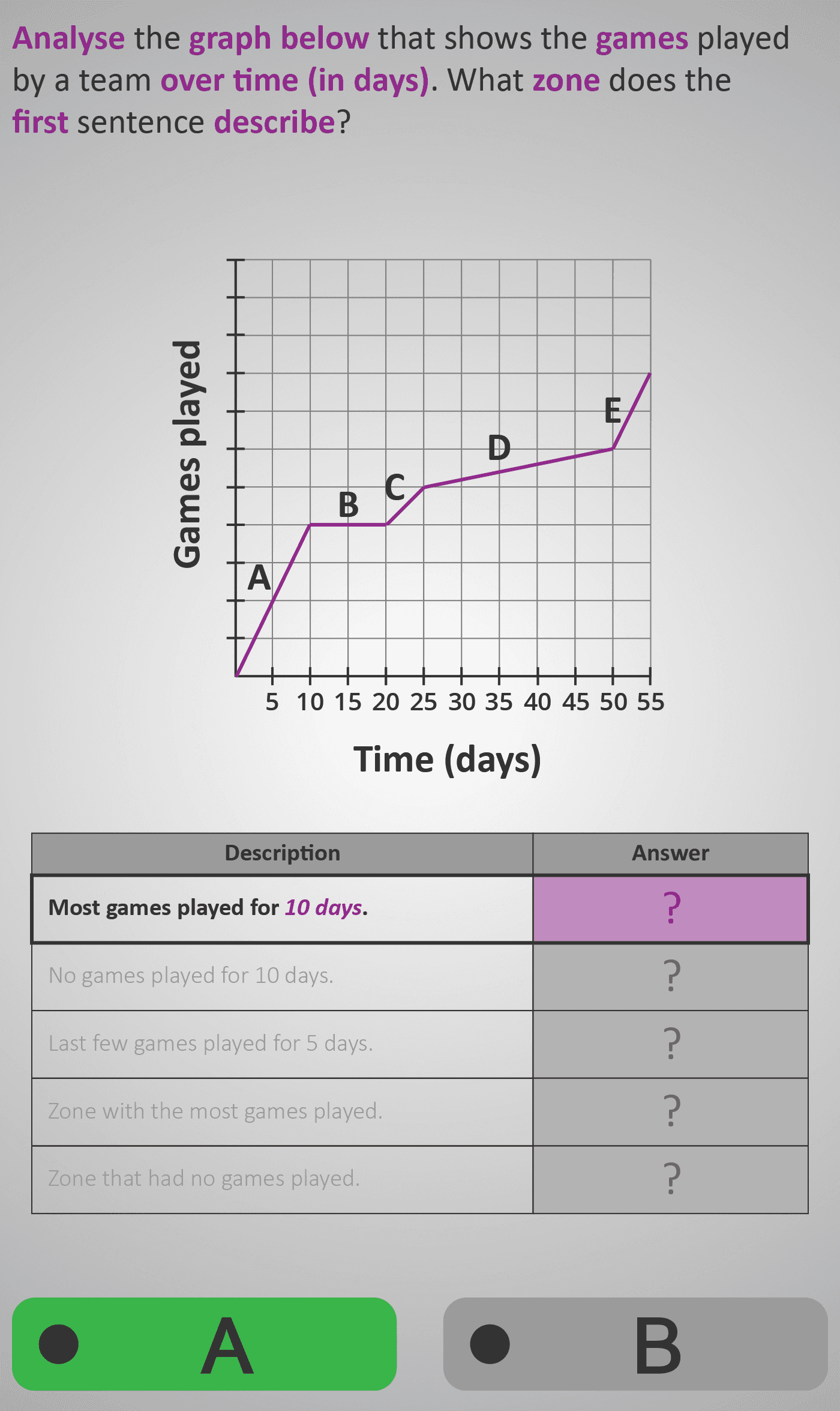
In this Phlow, learners analyse how data changes over time using a line graph that tracks the number of games a team played across a 50-day period divided into zones (A–E). They connect the shape of the graph — rising or flat — to what’s happening in the real-world scenario.
Step by step, students learn to:
- Identify which sections of the line show activity increasing (games being played).
- Recognise flat sections that mean no new games were played.
- Interpret steep slopes as faster progress and gentle slopes as slower activity.
- Compare zones to find which were the most or least active periods.
Each interactive step links visual features (slope and flatness) with written descriptions, turning abstract data into meaningful, real-world stories of change. Learners discover how line graphs show not just quantities but trends and patterns over time.
- Read and interpret data represented on a time-based graph.
- Explain the meaning of rising and flat lines.
- Identify changes in pace or consistency using slope comparison.
- Relate graphical patterns to real-world actions and timelines.
Prerequisite Knowledge Required
- Understanding of axes: x-axis = time, y-axis = quantity.
- Ability to read and compare values on a numerical scale.
- Awareness that flat lines mean “no change,” while slopes represent “change over time.”
- Experience reading simple bar or dot graphs (see earlier Phlows).
- Linked earlier Phlows: Analyse 4D – Interpreting Pictograms and Totals; Analyse 4E – Reading and Comparing Points on a Graph; Compare 3A – Comparing Quantities and Patterns.
Main Category
Analyse → Data Representation → Line Graphs (Change Over Time)
Estimated Completion Time
Approx 10–12 minutes (5–6 guided interactions).
Learning Outcomes
- Identify and describe trends shown in line graphs.
- Distinguish between periods of activity, inactivity, and change.
- Match written statements to visual graph sections.
- Explain slopes and flat sections in real-world terms.
Cognitive Load / Step Size
Moderate — each interaction isolates one interpretive skill: recognising a change, comparing activity levels, or linking slope steepness to rate. Consistent structure (zones A–E) and colour cues support steady conceptual progression.
Language & Literacy Demand
Medium — key phrases such as “most games played,” “paused,” and “rate of change” connect descriptive language to visual data. This develops mathematical literacy without requiring formal terminology.
Clarity & Design
- Clear grid lines and labelled zones (A–E) provide structure for reasoning.
- Purple line and highlights emphasise slopes and flatness for each question.
- Interactive questioning focuses learners on meaning rather than memorisation.
- Visual rhythm mirrors how data unfolds over time, aiding comprehension.
Curriculum Alignment
Strand: Data and Chance
Learning Outcome: Students interpret and represent data using line graphs that show change over time, describing trends with mathematical language.
(Aligned with Junior Cycle Mathematics – Strand 2: Statistics and Probability, Learning Outcome 2.6.)
Engagement & Motivation
The sports performance scenario makes the task relatable and dynamic. Students think like analysts, reading trends and inferring causes for changes, experiencing how mathematical interpretation applies beyond the classroom.
Error Opportunities & Misconceptions
- Mixing up x-axis (time) and y-axis (games played).
- Interpreting flat lines as “zero” instead of “no new games.”
- Misidentifying which zone shows most or least activity.
- Ignoring equal spacing between time intervals.
Scaffolded hints and colour-coded feedback correct these errors quickly and reinforce understanding through visual contrast.
Transferability / Real-World Anchoring
Understanding line graphs is vital across science, geography, economics, and sports. Learners gain the ability to interpret progress, pauses, and rates of change — essential skills for reading charts in real life.
Conceptual vs Procedural Balance
Highly conceptual — students focus on interpreting relationships and trends, rather than calculation. The Phlow encourages reasoning and storytelling through data, deepening comprehension of rate and change.
What Your Score Says About You
- Below 20: Beginning to identify graph sections but unsure about slope meanings.
- 21–30: Understands general trends but may mislink activity levels to zones.
- 31–39: Accurately connects slope steepness and flatness to activity patterns.
- 40 / 40: Mastery — confidently interprets changes, pauses, and rates of progress across time.