Survey 4B
Overview
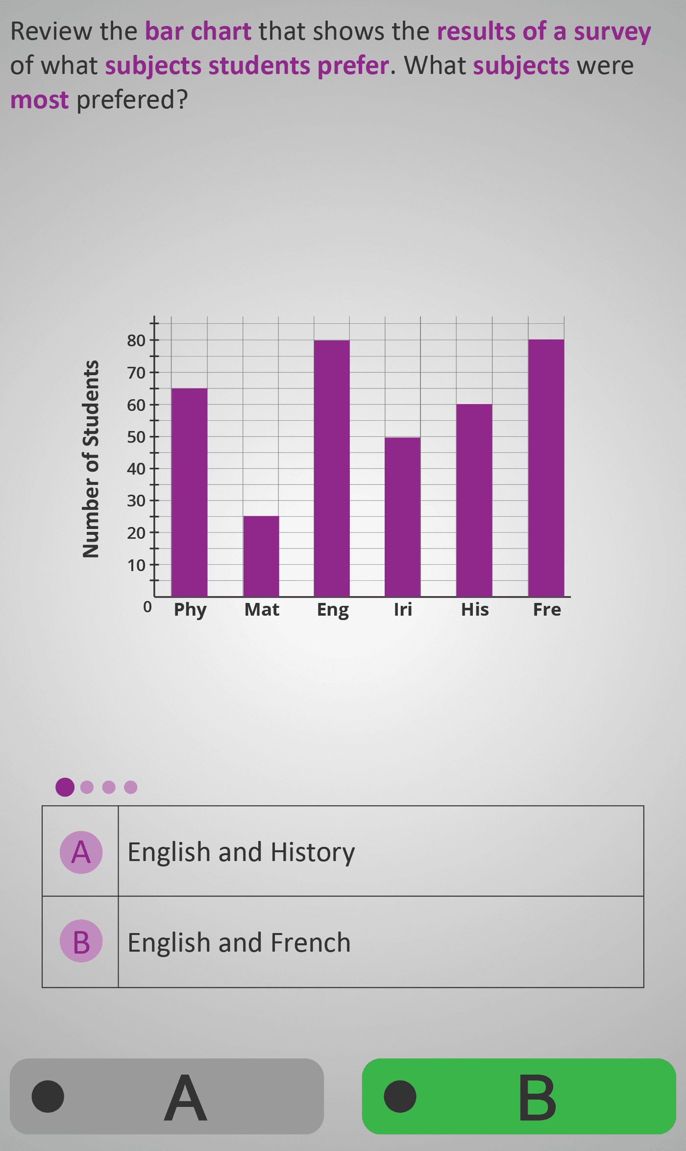
In this Phlow, students build data analysis skills by comparing categories on a bar chart. They identify which subjects are most and least preferred and then calculate the difference in student numbers using subtraction.
Learners practise interpreting the heights of bars as numerical values, recognising that subtraction represents “how much more” or “how much less” between two data points. Through step-by-step reasoning, they move from reading data to understanding variation and comparison in real-world contexts.
Worked Example
Subjects: English (80), Maths (25), History (60), French (80)

Step 1: Identify most preferred → English & French = 80
Step 2: Identify least preferred → Maths = 25
Step 3: Calculate the difference → 80 − 25 = 55
Result: English/French are 55 more popular than Maths.
Step Sequence
- Read the bar chart carefully to find category values.
- Identify which subject(s) have the highest frequency.
- Identify which subject has the lowest frequency.
- Subtract lowest from highest to find the difference.
- Interpret what that difference means in context.
Sample Prompts
- Which subject was most preferred?
- Which was least preferred?
- What is the difference between the highest and lowest?
- How much more popular is English than Maths?
Why This Matters
Understanding difference helps students describe and quantify variation in real data. This builds the foundation for later concepts such as range, mean, and data spread, linking visual comparison to numerical reasoning.
Prerequisite Knowledge Required
- Reading and interpreting bar charts accurately.
- Performing subtraction and understanding it as “difference.”
- Recognising comparative language such as most, least, and how much more.
Linked Phlows:
Survey 3B – Comparing Values in Bar Charts,
Subtraction 3A – Finding Differences,
Survey 4A – Converting Chart Data to Fractions and Percentages.
Main Category
Data & Statistics
Estimated Completion Time
Approx. 10–14 seconds per question.
40 questions total → Total time: 7–10 minutes.
Cognitive Load / Step Size
Low to moderate. Each step adds one decision: identify, compare, subtract. Logical sequencing and consistent visual cues prevent overload while maintaining cognitive engagement.
Language & Literacy Demand
Low. Phrasing is simple and repetitive (“most”, “least”, “difference”), with colour highlighting for key terms. The visual bar chart provides immediate meaning support for all literacy levels.
Clarity & Design
- Clean, evenly spaced bar chart with consistent scaling.
- Purple highlights and subtraction notation (e.g., 80 − 25) link visuals to calculation.
- Balanced use of colour and white space ensures clear focus on data comparison.
Curriculum Alignment (ROI Junior Cycle Mathematics)
- Strand: Data
- Learning Outcome: Interpret bar charts and pictograms to compare data, identify extremes, and describe variation using subtraction.
Engagement & Motivation
Comparing “most” and “least” values taps into natural curiosity and competition. Students feel motivated by discovering patterns and drawing conclusions from familiar topics like school subjects.
Error Opportunities & Misconceptions
- Misreading bar heights (e.g., 60 mistaken for 80).
- Reversing subtraction order (low − high).
- Ignoring ties for most preferred subjects.
- Misinterpreting “difference” as “sum.”
Transferability / Real-World Anchoring
High. Skills directly apply to interpreting sports results, survey findings, and real comparisons such as “Which sold more?” or “Which is more popular?” — foundational for everyday numeracy.
Conceptual vs Procedural Balance
Balanced. Students perform subtraction procedurally but learn conceptually why subtraction expresses difference. They connect visual variation with numeric relationships.
Learning Objectives Addressed
- Identify highest and lowest data points in a bar chart.
- Calculate the difference between two values using subtraction.
- Understand subtraction as a measure of variation or spread.
- Use mathematical language to communicate comparisons clearly.
What Your Score Says About You
- Less than 20: You may be reading scales incorrectly or reversing subtraction order — review bar heights carefully.
- 21–29: You can identify data extremes but sometimes miscalculate the difference — practise accurate subtraction.
- 31–39: You understand comparisons and calculate differences accurately — strong data reasoning.
- 40 / 40: Excellent analytical understanding — you can interpret, compare, and quantify differences confidently.