Survey 4C
Overview
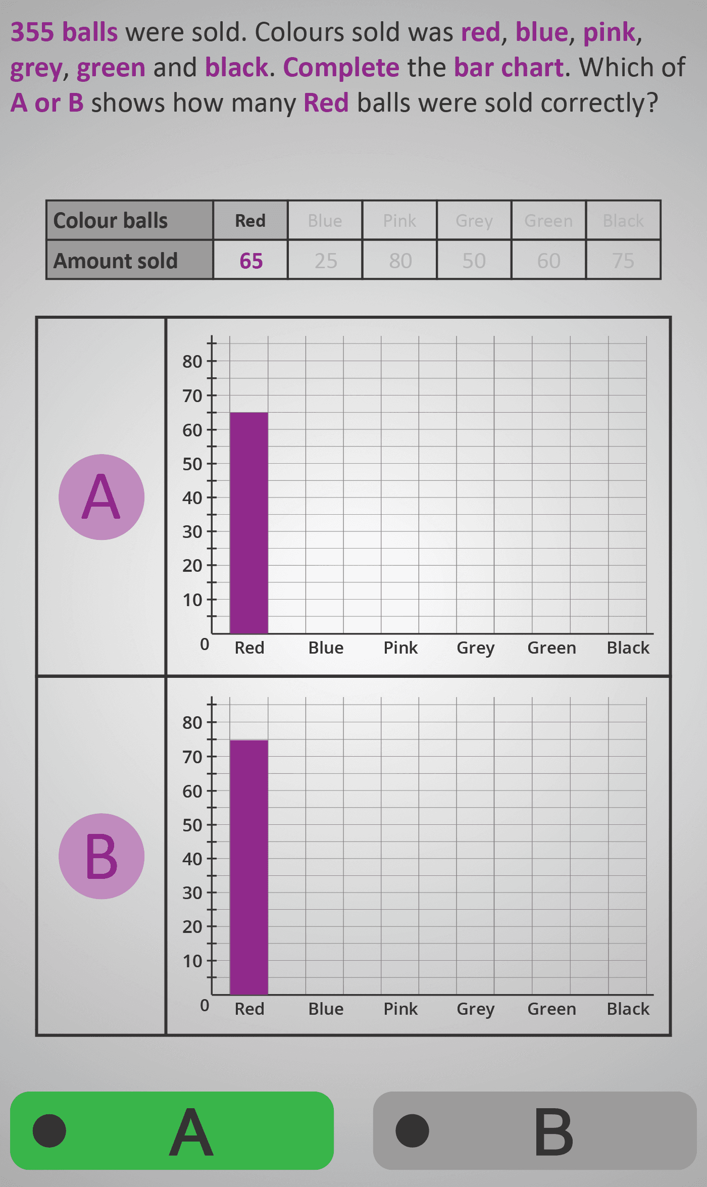
This Phlow strengthens students’ ability to translate numerical data into graphical form. Learners are given a data table showing the number of coloured balls sold (Red, Blue, Pink, Grey, Green, and Black — total 355) and two possible bar chart representations (A or B). Their task is to identify which chart correctly represents the data for the highlighted colour.
Each screen isolates one category, e.g., “Blue Balls,” with its value highlighted in the table and on both charts. Students compare bar heights, check the axis scale, and decide which option visually matches the numerical quantity. This bridges tabular reasoning and graphical interpretation, reinforcing the relationship between number size and bar height.
Worked Example
Table Data (Balls Sold)
Red: 90
Blue: 70
Pink: 50
Grey: 45
Green: 60
Black: 40
Total: 355

Question: Which chart correctly shows 70 Blue balls?
→ Chart A bar reaches 70 mark, Chart B bar reaches 60.
→ Correct answer: Chart A
Step Sequence
- Read the data value for the highlighted colour in the table.
- Look at both bar chart options (A and B).
- Compare which bar matches the correct height on the scale.
- Select the chart that accurately represents the data value.
Sample Prompts
- Which chart shows 70 Blue balls correctly?
- Does Chart A or B represent the number 50 accurately?
- Which bar reaches the correct scale mark?
- What total number is shown across all colours?
Why This Matters
Translating between tables and charts is an essential real-world skill. This Phlow helps learners see how raw numbers become visual comparisons, improving their ability to interpret, construct, and validate graphical data in school, work, and daily life.
Prerequisite Knowledge Required
- Reading and interpreting bar charts.
- Understanding numerical size and scale.
- Linking table data to corresponding chart elements.
- Basic comparison and estimation skills.
Linked Phlows:
Survey 3C – Reading Bar Charts for Single Categories,
Survey 4A – Interpreting Totals and Fractions,
Survey 4B – Comparing Most and Least Preferred Categories,
Place Value 3A – Understanding Scale and Value.
Main Category
Data & Statistics
Estimated Completion Time
Approx. 10–14 seconds per question.
40 questions total → Total time: 7–10 minutes.
Cognitive Load / Step Size
Low to moderate. Each question focuses on one colour and one decision — matching a value to a bar height. The repetition and isolated focus build fluency without overload, reinforcing a core graph-reading habit through consistent pattern recognition.
Language & Literacy Demand
Low. Short, repetitive question structure (“Which chart is correct?”) reduces linguistic strain. The task relies primarily on visual comparison rather than text interpretation, making it accessible to all learners, including those with weaker reading skills.
Clarity & Design
- Table and charts are cleanly laid out with matching colour labels.
- Purple highlights indicate the active category each step.
- Axes are clearly scaled for accuracy checking.
- Dual chart (A vs B) layout encourages evaluation rather than recall.
Curriculum Alignment (ROI Junior Cycle Mathematics)
- Strand: Data
- Learning Outcome: Represent data using tables and bar charts; read, interpret, and complete charts to ensure accurate numerical correspondence.
Engagement & Motivation
The “Which chart is correct?” question style feels like a mini visual challenge, turning interpretation into a game. The bright colours and real-world “sales data” context sustain interest and reward accuracy.
Error Opportunities & Misconceptions
- Misreading the y-axis scale (e.g., 25 mistaken for 30).
- Choosing the taller bar because it looks better visually.
- Ignoring the corresponding data table value.
- Mixing up which colour category is being tested.
Transferability / Real-World Anchoring
Very strong. These skills apply to reading any real-world chart — from sales reports to media infographics — where accuracy in visual interpretation matters for informed decision-making.
Conceptual vs Procedural Balance
Procedural with conceptual reinforcement. Learners practise a procedural matching task while developing a deeper understanding of how numbers correspond proportionally to graphical representations.
Learning Objectives Addressed
- Read and interpret data from a numerical table.
- Match numerical values to correct bar chart representations.
- Use visual proportional reasoning to check accuracy.
- Develop fluency in constructing and validating graphical data.
What Your Score Says About You
- Less than 20: You may be missing the link between the table and chart — review how numbers map to scale.
- 21–29: You can identify values but occasionally misread heights — check grid intervals carefully.
- 31–39: You interpret the relationship between numbers and visuals accurately — strong comprehension.
- 40 / 40: Excellent mastery of visual-to-numerical translation — ready for grouped and comparative data sets.