Survey 4J
Overview
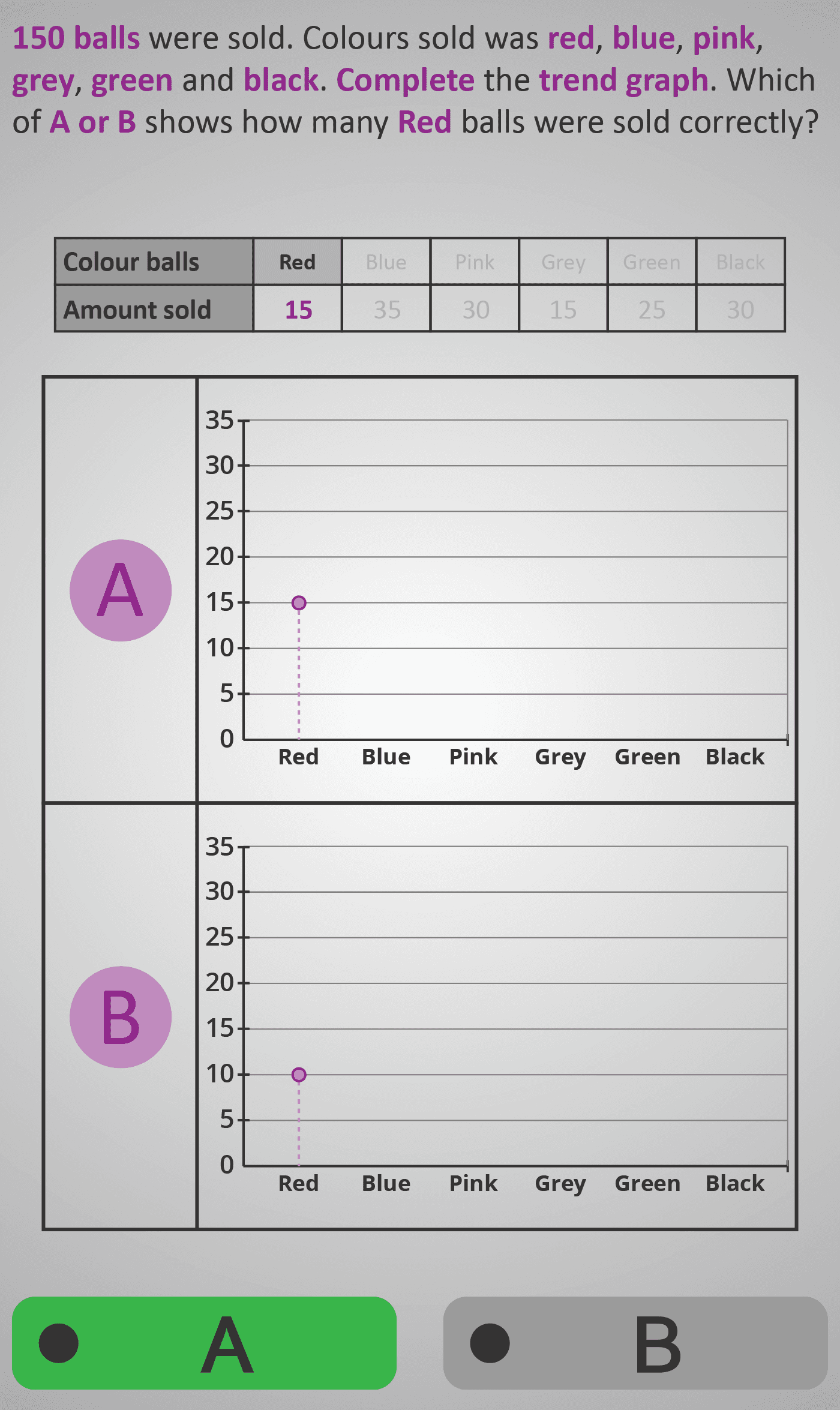
This Phlow helps students learn how to translate tabular data into graphical form by completing a trend (line) graph. Using a dataset showing the number of coloured balls sold, learners decide which of two graphs (A or B) correctly represents each value.
Each step isolates one data point — starting with single entries (e.g. “Red = 15”) and progressing toward multi-point trend completion. This sequential design helps students connect numerical values to their plotted positions on a graph and understand how the full trend emerges.
Worked Example
Data Table (Number of Balls Sold)
Red: 15
Blue: 20
Pink: 30
Grey: 25
Green: 35
Black: 25
Total = 150

Step 1: Read the value for Red → 15
Step 2: Check which graph plots Red at height 15
Step 3: Select the correct graph (A or B)
Step 4: Repeat for each colour to complete the full trend
Step Sequence
- Read the numerical value from the table.
- Locate the corresponding category on the horizontal axis.
- Compare Graph A and Graph B to see which correctly plots the point.
- Confirm that the plotted point aligns with the table value.
- Repeat to complete the full trend graph.
Sample Prompts
- Which graph shows the correct number of Blue balls sold?
- Does Graph A or B match the value 25?
- What pattern do you notice as colours change?
- Which colour had the highest sales?
Why This Matters
Building a graph from data is a core skill in mathematics and science. This Phlow bridges numeric reasoning and visual interpretation, showing students how numbers create patterns that can be analysed at a glance. Understanding this link strengthens data fluency and analytical confidence.
Prerequisite Knowledge Required
- Reading and comparing numerical data in tables.
- Understanding of horizontal and vertical graph axes.
- Experience with basic plotting on coordinate grids.
Linked Phlows:
Survey 4H – Fractions and Percentages from Graphs,
Survey 4I – Comparing Highs and Lows on Graphs,
Bar Chart 3C – Drawing and Reading Bar Graphs,
Coordinate 3B – Plotting Points.
Main Category
Data & Graphs / Representing and Plotting Data
Estimated Completion Time
Approx. 10–14 seconds per question.
40 questions total → Total time: 7–10 minutes.
Cognitive Load / Step Size
Moderate and well-scaffolded. Each question adds one new plotted point, letting learners build understanding gradually. The consistent layout reduces cognitive demand, supporting focus on visual–numeric matching.
Language & Literacy Demand
Low. Instructions use short, familiar phrases (“Which graph shows…?”). Colour names and numeric labels are clear and repeated, minimising reading requirements while maximising visual reasoning.
Clarity & Design
- Line graphs maintain identical structure and scaling across screens.
- Colour-coded dots emphasise the active data point.
- Bold prompts link each question directly to the visual focus.
- Consistent purple highlighting reinforces continuity and attention.
Curriculum Alignment (ROI Junior Cycle Mathematics)
- Strands: Data & Algebra (Representing and Interpreting Data)
- Learning Outcomes: Represent data using line graphs; compare values and identify patterns; translate data between tables, charts, and graphs.
Engagement & Motivation
The colour-based dataset creates a visually engaging and low-pressure environment. The A/B comparison introduces a puzzle-like element that keeps learners alert and invested in accuracy.
Error Opportunities & Misconceptions
- Plotting at incorrect heights due to scale misreading.
- Mixing up categories (e.g., switching Blue and Green).
- Misinterpreting the horizontal axis as quantity rather than category.
- Drawing connecting lines incorrectly between non-adjacent categories.
Transferability / Real-World Anchoring
High. Understanding how to match data to graphs is essential for reading and presenting information in reports, experiments, and real-world problem solving across science, geography, and business.
Conceptual vs Procedural Balance
Balanced. Students practise accurate plotting (procedural) while also understanding how graphs communicate trends and relationships (conceptual). The exercise prepares learners for higher-level data interpretation and algebraic graphing.
Learning Objectives Addressed
- Interpret and complete a line graph using tabular data.
- Read and apply vertical and horizontal scale values accurately.
- Recognise patterns and trends visually.
- Check correspondence between table entries and plotted points.
What Your Score Says About You
- Less than 20: You can read table data but may struggle to match values on the graph scale.
- 21–29: You understand most data but sometimes mis-plot or misread individual points.
- 31–39: You plot accurately and recognise emerging trends — excellent progress.
- 40 / 40: You demonstrate mastery in translating numerical data into visual trends — strong analytical and graphical fluency.