


Pie Chart 3C
Overview
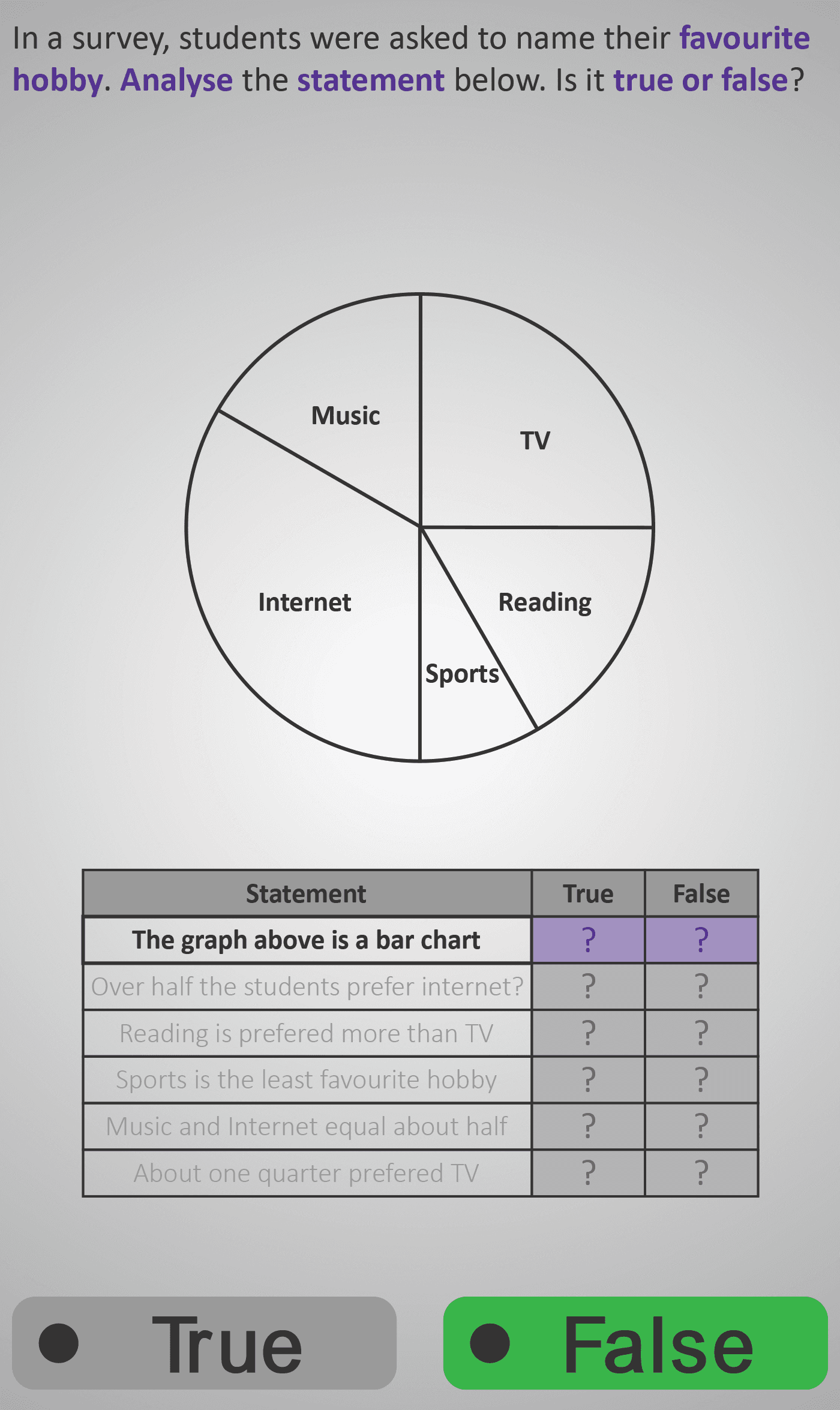
In this Phlow, learners advance from reading and calculating data in pie charts to evaluating statements about what a chart shows. Using the same “Favourite Hobby” pie chart, students decide whether each claim — such as “Over half the students prefer Internet” or “Sports is the least favourite hobby” — is true or false based on the visual evidence.
The activity encourages analytical reasoning as students:
- Observe the chart and compare sector sizes visually.
- Interpret statements carefully, focusing on clue words like more than, half, least, and equal.
- Judge whether the statement matches what the pie chart shows.
Each screen isolates a concept — chart type, majority proportion, least favourite, equality of sectors, or fractional reasoning (e.g. “About one quarter preferred TV”). This step-by-step approach helps learners move beyond calculation to deeper data interpretation.
By the end, learners understand that interpreting data involves both numerical reasoning and logical analysis — essential skills for higher-level maths, science, and everyday decision-making.
Prerequisite Knowledge Required
- Pie Chart 3A – Reading Data from a Pie Chart.
- Pie Chart 3B – Converting Between Angles and Values.
- Fractions 3A – Comparing Parts of a Whole.
- Data 2C – Bar and Pictogram Comparison.
- Understanding that a pie chart represents parts of a 360° circle.
- Ability to compare sizes of sectors to judge relative proportions.
- Familiarity with terms like more than, less than, about half, about a quarter.
Main Category
Data / Charts and Graphs
Estimated Completion Time
Approx. 10–12 seconds per screen (6 screens total) → 4–5 minutes total.
Cognitive Load / Step Size
Moderate to High — while no calculation is needed, reasoning demand is greater. Students must hold both visual data (sector size) and linguistic meaning (statement phrasing) in working memory to judge correctly.
Language & Literacy Demand
High — this Phlow blends mathematical interpretation with reading comprehension. Students analyse statements like “Over half the students prefer Internet” and match them to visual evidence. Purple-highlighted keywords guide focus to logical structure.
Clarity & Design
- Pie chart displayed above, statements below in clear table format.
- True/False colour feedback reinforces accuracy visually.
- Statements fade in sequentially to focus attention on one idea at a time.
- Familiar hobby categories link back to earlier Phlows for continuity.
Curriculum Alignment
Irish Mathematics Curriculum – Data Strand / Junior Cycle Learning Outcomes 1.9 & 1.10
- Analyse and evaluate data presented in pie charts.
- Identify accurate and inaccurate conclusions drawn from data.
- Develop reasoning skills to justify interpretations and decisions.
Engagement & Motivation
High — learners act as data detectives, deciding which statements are true or false. The interactive, real-world context (“favourite hobby”) keeps engagement high, while instant feedback encourages self-correction and critical reflection.
Error Opportunities & Misconceptions
- Confusing chart type (pie vs bar).
- Misjudging what half or quarter looks like visually.
- Assuming equal text spacing means equal data proportion.
- Overlooking comparative wording (more than, less than).
Each misconception is tackled progressively — reinforcing visual reasoning and critical interpretation.
Transferability / Real-World Anchoring
High — this skill builds data literacy for real-world contexts, including media reports, infographics, and surveys. Learners practise questioning claims and using evidence — a key life and academic skill.
Conceptual vs Procedural Balance
Strongly Conceptual — students focus on interpreting and justifying reasoning rather than performing calculations. This shift develops higher-order thinking and prepares them for argument-based problem-solving.
Learning Objectives Addressed
- Evaluate whether statements about a pie chart are true or false.
- Use visual reasoning and proportional understanding to justify answers.
- Recognise that interpreting data involves both logic and mathematics.
- Explain conclusions using correct mathematical vocabulary.
What Your Score Says About You
- Less than 5: Slow down and match each statement’s wording carefully to what the chart shows.
- 6–7: You’re improving at reasoning with data — focus on linking words like “half” and “quarter” to visual proportions.
- 8–9: Excellent interpretation skills! You can confidently read and evaluate data logically.
- 10 / 10: Fantastic! You’re ready for Pie Chart 4A, where you’ll create your own pie charts from data sets and explain them.